Saturday, August 21, 2010

Vacation Week

My final studio day before heading off to our cottage was a productive one. My new piece is almost ready for the language imagery that will complete it – before I left for vacation, my thoughts took a sudden, playful fork.

DSCN5757 A quick attempt to get some ideas put down on cloth.  In previous Relic pieces, I marked the surfaces with ancient inscriptions. Then I began to realize that “ancient” is a relative term – today many people consider the 1950’s ancient.  My mind is toying with creating a surface that reflects one young man’s desire for the world to remember him.

BUT FIRST – Off to the Lake!

 DSCN5766

Our small slice of summer perfection – a quiet week at our cottage in Central New York on Panther Lake, a lake so small it looks like a pinpoint on the map!

Perfect summer weather made our time at the cottage a joy. In between kayaking and paddle boating and swimming, I kept the creative fires stoked by reading contemporary drawing books and doing some experimental sketching.

DSCN5773

I alternated between making lines and shapes with various pens and graphite and charcoal pencils…

DSCN5763

…and even had time to explore the area for interesting hand-lettered signage.

A great vacation!

Saturday, August 14, 2010

Essential Design Tools

How do you work through your design ideas as you are composing a work? The best resources I have for stepping back and looking at my work objectively are my  Coolpix digital camera and photo software.

In the years before I used this dynamic duo:

  • I took Polaroid pictures and hung them on my design wall.
  • I turned away from the wall and held up a pocket mirror and looked at the work in it backwards.
  • I  removed my glasses and squinted.
  • I looked at it in the dark so just the value contrasts stood out.
  • I turned it a quarter turn and viewed it from each orientation to see what it revealed about my composition.
  • I carried my piece from room to room, laid it over a couch or chair and then let my eye catch a glimpse of it each time I passed through.

Now, I shoot images of the work on my design wall and can immediately load and view them on my computer to evaluate where I am.

I’ve spent this week working on the fifth Relics piece. Here’s some details of its evolution to date:

DSCN5660

One layer of monoprinted dye on the silk – this is a detail – the full  piece is 65” long x 55” high. At first a vertical orientation, I changed it to horizontal.

DSCN5695

First layers of added dye painting. It definitely does not look aged yet.

DSCN5703

Beginning to define the lines and crevasses.

DSCN5728

Adding more color.

Friday detail

Deepening and darkening areas. My intention with each layer is to age the surface and create more visual depth and definition. I’ve shifted now from dyes to paints. This is a detail of where I left this new piece yesterday.

I am still adding line work and defining the crevasses. Once that’s done, I will be ready to add the language elements to the surface that suggest ancient inscriptions -- or possibly play on the “ancient writing” theme with some 20th century graffiti.

Whether this piece ends up on the “sample” pile to be made into smaller works or actually proves to be successful on a large scale, it is teaching me a lot.

Thursday, August 5, 2010

Process Notes: Painted Archaeologies

 DSCN5672

One of  two new pieces on my print table, still wet from creating an underpainting on the monoprinted surface.

A newly completed work is a rich resource of  “coulda shoulda wouldas” – not in a critical sense, more in an “imagine if…” context. A great jumping off place for a new work is to respond to the one that’s just been completed. If you did it again, what would you do differently? What would make it richer, more compelling, more articulate?

Having just put the finishing touches on the fourth piece in my Relics series, I am working through my responses to this one – both the likes and dislikes – on two new pieces.

In these, I hope to explore variations on color, composition  and marks that can best convey the feel of ancient writings scrawled or carved on aged, worn, eroded surfaces .

DSCN5629

Here’s a snippet of  Relic 4.  I can’t show the whole image because I’m considering entering it in  an international juried exhibition that prohibits any images of accepted works being reproduced or exhibited prior to the show opening.

Friday, July 30, 2010

The Subject is Line

Whilst still struggling with EXACTO knife cutting and rubber cement gluing, I am starting to warm to cutting and composing with paper.

DSCN5638

Here’s my response to this week’s Design Course line assignment, which is to vary line weight and size, overlap some lines, create definition and an illusion of space and try to create a sense of depth. If not altogether a smashing success, at least my piece has variety and visual interest.

I’m quite looking forward to our group crit next Thursday evening (sadly, our final class) and seeing more clearly how I could improve the line work in this piece. I’ll share that feedback with you if you are interested – or you can share your own reactions to this exercise now and see  how your reactions compare to the instructor’s and other class members’.

As an accompaniment to doing these line exercises, I’ve also been reading Steve Aimone’s latest book, Expressive Drawing: A Practical Guide to Freeing the Artist Within.

The spontaneous and playful part of me loves the exercises, images, references and quotes in this book. I look forward to setting aside the EXACTO knife a bit for a paint brush and a large piece of paper and painting big, spontaneous, expressive marks.

Friday, July 23, 2010

What Next?

A fertile, production period of time has drawn to a close and my creative life feels almost eerily calm and quiet. No more white- water-rapids-ride of productivity. Now there’s more like a steady current beneath my vessel. I feel alert, attentive, all my senses keenly tuned – ready and waiting for “what comes next.”

During this hiatus, I am looking closely at the work that I’ve produced this past six months and feeling for the strongest pulse. Where the most excitement is, that’s the direction to pursue next.

While this self-inventory is in process, I’m taking some time in my studio to do some samples and make some new tools.

DSCN5603

Sample detail, monoprint with wax resist and painting.

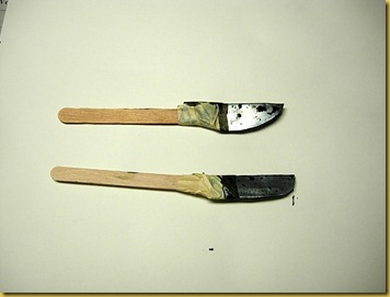
I also am exploring the cola pen, made by cutting and folding a piece of aluminum cut from a cola can and taping it to a stick.
DSCN5620

Several examples of “cola pens” I’ve made.

DSCN5618

Cola pen writing sample on Bristol paper with DyNaFlo paint.

To stir up the inspiration soup, I’m also participating in a four-week pilot design class from Rebecca Howdeshell that she will soon be offering online. Here is also a link to  Rebecca Howdeshell Studio Art, which explains her artist concept and displays some of her beautiful art work.

In conjunction with the class, my attention has been drawn even more to line. All good, all strengthening my observation.

DSCN5545

Notice the lines of these tree branches reflecting on shallow water with the rock shapes beneath. One of my favorite images from our recent trip to the Adirondacks.

I am greatly enjoying the class. Rebecca is an excellent teacher  -- she will soon be publicly offering online design classes as well as a portfolio review service. Check back on her blog or mine for an announcement soon.

Saturday, July 17, 2010

Entwining Alphabets at Adirondack Center for the Arts

DSCN5509

Adirondack Lakes Center for the Arts in Blue Mountain Lake – a small but vibrant facility.

DSCN5525

Gallery director Cornelia Tobey did an excellent job of installing my work in the gallery space.

DSCN5517DSCN5510

Having three large windows dividing the wall space inspired innovative hanging of my Pages pieces.

 DSCN5522

The split colors of the gallery walls had been of great concern to me – but serendipitously created a visual illusion that I can use intentionally in future works. Notice in the angled corner piece that the white letterforms leap forward at the top where the wall is dark; once the wall behind the work shifts to pure white, the gray letterforms pop and the white ones recede – even though the piece is identical from top to bottom.

DSCN5523 Fellow artists Debbie Bein and Judith Plotner (along with her husband Stan) attended my reception. It was  wonderful to meet them both in person.

 DSCN5935

We turned the opening into a getaway weekend and stayed at The Hedges for three nights. This Adirondack family great camp dates back to 188o and was restful and relaxing.

Once I returned home, I immediately started working on two applications for future solo exhibitions. This experience intensified my desire to show my work collectively because solos heighten the creative process and link it to a specific space and time.

A solo opportunity is not just about the location or scale or sophistication of the exhibition space. Solos are catalysts for growth, experimentation and new work.

My work leaped forward this past six months in response to this opportunity, in part because in my heart I treated it just as if it were an invitation to participate in the Whitney Biennial or the Guggenheim.

That same attitude will propel me forward as an artist and I can hardly wait to discover where my next solo exhibition will be!

Wednesday, July 7, 2010

New Small Work: “AKA Letters at the Edge”

I finished this small work last week, too late to include in my current exhibition.  Contrasting the positive letterform shapes with negative space ones (that strip along the right is cut from portions of the same alphabet as the positive letter form shapes) has a lot of potential and I’ll be working with this idea again in the future.

The light marks on the darker horizontal band are hand stitched. Every step of making this piece felt playful and relaxed.

AKA Letters from the Edge2

AKA Letters at the Edge, 2010, 20” x 20”, silk, applied silks, synthetic fabric, monoprinted and screen printed, painted and stitched, mounted on stretched canvas. $350.