Way back in January I found a link to Christine Kane's blog post on New Year's Resolutions. Her blog is www.christinekane.com/blog and it's always wonderful to read her wise and humorous takes on living creatively. The post suggested that instead of making the same old resolutions, to try selecting one word as a theme word for the year. The rest of the year all you have to do is hold your word quietly inside and let it guide you to take action.
I thought a lot about The Word. It's always hard for me to pick one of anything and I was tempted to take two, but I relented and chose one that seemed as all-inclusive as any one word could be. I chose the word "fruition" -- which the dictionary defines as "the attainment of anything desired; realization of good results."
For the first month or two, I thought a lot about what desires I might wish to attain, both this year and beyond, and what I truly wish to attract in my life. Here are just a few I came up with by March:
1. Create a strong, expressive body of work.
2. Attract recognition for my art and opportunities to exhibit and sell it.
3. Experience vibrant well-being on every level -- physical, emotional, psychological and spiritual.
4. Create happy memories with family and friends.
Choosing this word has led me to adopt a new mind set. For many years I've always thought of myself in the process of Becoming. I was working hard To Become a good artist. I studied, I worked, I was committed and disciplined. But the word "fruition" to me is a challenge. It is the very image of "Being" -- ripe, succulent, juicy -- harvesting rather than seeding and planting. I have had to acknowledge that I AM a Good Artist. I'll get better, I'll continue to grow, but I Am.
So here we are, halfway through 2008 and all the desires that I have expressed and continue to launch out into the universe are unfolding this year. My first solo exhibition in a gallery, my first sale to a private collection, my first unified body of work are all a cause for celebration. Being invited to sell my work at the gallery shop, being invited to teach locally and inheriting a small nest egg to pay for my studio for the next few years are all amazing manifestations since January.
Sometimes I get tired and feel my spirits droop. Writing these words reminds me of how much abundance there is in my life. I feel youthful, energetic and stimulated intellectually and creatively by my art. My home is beautiful and comfortable, my family and friends are supportive and proud of me. I do what I love and I share that love of creating with others.
So while my branches are producing a banner crop of fruit, here are some of the practices I hope to continue for the rest of 2008:
Anticipate the positive each day and receive it with an open heart.
Pay attention to the inspirations and insights each day brings.
Express appreciation each day.
Move with the current; allow delight and surprise into every day.
Saturday, June 28, 2008
Thursday, June 26, 2008
Marinating Your Head
Lauren wrote to me after seeing an HBO documentary "Painting with Words" about writer David McCullough (I haven't watched it yet.) One of the phrases she recounted that David uses in describing his creative process is "marinating your head" -- soaking up atmosphere and inspiration before beginning projects. What a great analogy and how appropriate to the way I work.
Obviously two whirlwind days cruising through NYC and two amazing museums, the Metropolitan AND MoMa created a wonderful marinade. Enjoying time with my son, who also loves art , seeing his new apartment and neighborhood and taking several long walks through Central Park added to the pleasure of the trip. I made up for the loss of sleep with long naps yesterday and today am heading up to my studio to steam and wash out two pieces of silk, then lay out and print several more to process tomorrow. Making new cloth is the name of the game this summer, along with experimenting with calligraphy symbols and then incorporating some onto the cloth surfaces in some way.
 One piece that I printed (the yellowish-orange places are the dried resist) is much darker than the other one.
Obviously two whirlwind days cruising through NYC and two amazing museums, the Metropolitan AND MoMa created a wonderful marinade. Enjoying time with my son, who also loves art , seeing his new apartment and neighborhood and taking several long walks through Central Park added to the pleasure of the trip. I made up for the loss of sleep with long naps yesterday and today am heading up to my studio to steam and wash out two pieces of silk, then lay out and print several more to process tomorrow. Making new cloth is the name of the game this summer, along with experimenting with calligraphy symbols and then incorporating some onto the cloth surfaces in some way.
One piece that I printed (the yellowish-orange places are the dried resist) is much darker than the other one.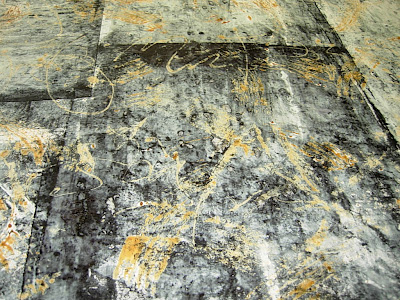 Both the lighter and darker values will be quite useful. I'm interested to see how the resist marks look once they're steamed and rinsed. I'll screen text and paint language marks on these surfaces for new Pages constructions.
My trip to NYC also offered me an early morning hour to sit quietly in the second floor Barnes and Noble cafe' overlooking Fifth Avenue, where I people watched and sketched out several new ideas for Pages constructions. Getting an image in my mind of how I can put the elements together in a new way increases my eagerness to get back to work.
Another happy bit of news arrived via e-mail while I was away -- my class, Experimental Painted Textiles, at the Memorial Art Gallery, has enough students enrolled for the three afternoon class on July 14-16. I plan to use different types of resists for creating textural marks in each of the three sessions. We'll work with cut and torn paper, then water soluble liquid and soy wax resist. The goal of the class is to become more familiar with fabric painting and to translate marks and patterns from nature onto cloth surfaces. If you live in the Rochester, NY area, check out the workshop description at www.mag.rochester.edu/creativeworkshop.
Sunday, June 22, 2008
Reward Time!
I spent all morning yesterday extensively revising and editing (for the third time) the book review article I've been writing about Interpreting Art: Reflecting, Wondering and Responding by Terry Barrett, a professor at Ohio State. I'm working on it this morning again. Today is IT, no more tweaking and changing, I'm determined to complete it and send it off. This is my LAST writing commitment for the year; yay! I love to write but the editing and revising seem to go on forever and keep me away from my visual work. The old writerly discipline and detail-orientation tend to dominate the artist-explorer in me when a deadline nears. By this evening I'll send the final draft to the editor and exhale. Now it's officially summer-time-and-the-livin'-is-easy time for me!
What better way to reward my inner artist for letting my writer self have its due than a somewhat spur of the moment art adventure! I'll drive to the airport at 4AM tomorrow morning, meet up with a friend who's traveling to NYC on business (she designs fabrics) and board a 6 AM Jet Blue flight to JFK. We'll arrive in mid-town Manhattan before 9 AM. Monday will be dedicated to MoMa -- my son lives in Manhattan and will meet me there, I'm really looking forward to enjoying his company -- and then we'll all have dinner together. Tuesday morning we'll head of to the Metropolitan, where we'll spend half a day exploring their collections (they luckily open at 9:30 AM!), head for the airport mid-afternoon and arrive back in Rochester about 9 PM Tuesday night. One night and two art-filled days, a perfect amount of time in the Big Apple and nothing I'd rather do instead except maybe see back-to-back stage plays and musicals! But that will have to be another adventure.
What better way to reward my inner artist for letting my writer self have its due than a somewhat spur of the moment art adventure! I'll drive to the airport at 4AM tomorrow morning, meet up with a friend who's traveling to NYC on business (she designs fabrics) and board a 6 AM Jet Blue flight to JFK. We'll arrive in mid-town Manhattan before 9 AM. Monday will be dedicated to MoMa -- my son lives in Manhattan and will meet me there, I'm really looking forward to enjoying his company -- and then we'll all have dinner together. Tuesday morning we'll head of to the Metropolitan, where we'll spend half a day exploring their collections (they luckily open at 9:30 AM!), head for the airport mid-afternoon and arrive back in Rochester about 9 PM Tuesday night. One night and two art-filled days, a perfect amount of time in the Big Apple and nothing I'd rather do instead except maybe see back-to-back stage plays and musicals! But that will have to be another adventure.

Between Earth and Heaven, El Anatsui, 2006, 91" x 126", bottle caps, aluminum and copper wire, collection of the Metropolitan Museum of Art, New York City, NY.
Here's one of the works I am quite excited about seeing. The Metropolitan has just acquired a piece by El Anatsui titled "Between Earth and Heaven." El Anatsui is a Ghanan-born sculptor (1944) ,who teaches art at a Nigerian university. I discovered his work about three years ago. He takes found materials, particularly flattened bottle caps and bands from the outer rims of liquor bottles and joins them with wire into large-scale cascading sculptural forms. Reviewers have described his works as referencing textiles, particularly quilts.

 The components are easier to see in these detail shots. One of the most intriguing aspects of these sculptural works is El Anatsui's attitude towards installing them. He says that each time he hangs one it seems to respond differently, protruding forward or caving inward to create variations in shape. The structures seem to form their own topography. Anatsui prefers to let the work determine where it will ripple and how, to allow the work to evolve in context and to alter over time. Given the nature of aluminum and copper wire, that must stretch and alter the way the works hang as well. While the beauty of the work itself and its cultural implications create interest on one level, the artist's willingness to let the piece alter and reshape itself over time is what I love most about his approach to his art.
So seeing this new acquisition at the Met is one stop that I am definitely excited to be making, even while types of language marks and tools for creating them will still be gestating while I absorb and enjoy other artists' works, ideas and processes.
Thursday, June 19, 2008
Marks and Mellowness
It's giving me great pleasure to quietly explore making language marks and start printing new cloth without any pressures or deadlines. I'm starting to find my rhythm again; a slow, steady hum, almost meditative. I spent a lovely, low-key day at my studio today washing and drying new cloth, which I then stretched out on my print tables. I spent the rest of the time exploring tools and more tools for making marks, plus dyeing a few yards of silk habotai to print on with textile paints. One great brush that I've found for calligraphic marks is a flat synthetic brush. The one I used for this mark was only about half an inch wide; I'm going to invest in a wider one as well. The one I used today has a lot of spring to it and seems to glide easily across the surface, plus it seems to hold more paint than the sumi brushes do. The calligraphic mark above is about the tenth one I did today and the first one that looks freer and more relaxed. My goal is to fill this particular sketchbook with nothing but language marks, trying out and noting what tools I prefer for different types of marks. Reed pens are quite enjoyable to use as is the Y & C 3. 5 calligraphy pen, which has a hard chisel tip.
 One great brush that I've found for calligraphic marks is a flat synthetic brush. The one I used for this mark was only about half an inch wide; I'm going to invest in a wider one as well. The one I used today has a lot of spring to it and seems to glide easily across the surface, plus it seems to hold more paint than the sumi brushes do. The calligraphic mark above is about the tenth one I did today and the first one that looks freer and more relaxed. My goal is to fill this particular sketchbook with nothing but language marks, trying out and noting what tools I prefer for different types of marks. Reed pens are quite enjoyable to use as is the Y & C 3. 5 calligraphy pen, which has a hard chisel tip.
To get my fabrics ready for the next stage of printing, I decided to monoprint different types of calligraphic marks on with a resist. The marks above were brushed with a foam brush on to a Plexiglas plate and then monoprinted onto the cloth.
 Then I filled up a gold-tipped applicator bottle and started creating illegible handwriting on the Plexiglas and monoprinted that onto the cloth. Since I'll be monoprinting dyes over both lengths of cloth when I go back to my studio this weekend, it will be interesting to see if these marks read as language marks once the pieces are dyed and washed out.
I'm also working on some new silk screen designs, so while I worked in pretty relaxed manner, I did actually get a lot done, including cleaning out all the old dyes that were in my refrigerator and washing out all the containers so I can start with fresh ones this weekend.
Tomorrow I'll be driving to Ithaca to get six of the new pieces from the Notations exhibition photographed so Holly can put them up on my website, which we'll start redesigning next week. Then I'll be back in my studio on Saturday and Sunday and hopefully will end the weekend with some great new pieces of cloth underway that will help launch new Parables and Pages pieces!
Tuesday, June 17, 2008
Panning for Gold
On Friday morning an excellent area photographer, Dan Neuberger, came and took professional shots of the "Notations" installation. These will be helpful in applying for other solo exhibition opportunities. Then yesterday morning -- how quickly the time passed-- we took the "Notations" works down. In every way it was a wonderful experience and I'm looking forward to more!
But then it was back to the current process of sifting and sorting. Where does the "finding gold" part finally arrive in this panning process? I've spent a fair amount of time now testing and sampling ideas and variations. It takes patience and self-discipline at this stage and I get tired of cutting, trying to visualize what one block will look like repeated, what ways I might vary the process and components for the next piece. There's nothing wrong with most of the ideas I've tried -- but they're more like the tiny flakes of gold that panners accumulate rather than a good-sized nugget . I keep panning and sifting though, reaching for that one piece of gold that can excite my imagination and engage my attention.
 I need to keep practicing these free form drawn letterforms. Some of them work together and some of them are less visually pleasing. Part of my practice in developing future invented letter forms will be to create marks that have more unity, much like any alphabet does. Another benefit from creating this piece of fabric is that it also helped me realize that I prefer language marks that flow across the surface like writing instead of drawn inside premeasured spaces.
I did cut all these letterforms apart yesterday, though, to experiment with them. First I kept the large center rectangles intact and surrounded them with darkest values to accent the light centers and create a bit of depth. I did cut off portions of the letter forms, where possible, so not all of them stay neatly within the borders.

Then I wondered what would happen if I combined my tiny rectangle pieces with fabrics cut into strips...or moved from rectangles to strips of fabric oriented both vertically and horizontally on the surface. This idea has the potential to be one of the "nuggets" I've been waiting for!
So here's a piece that's been cut apart vertically and surrounded with small, dark rectangles to frame and separate the letter forms from each other. The rectangles around each piece will form a very dominant element when combined. This decreases the importance of the individual letter forms in the openings, or so I think at the moment.
 But adding any separation between the letter forms seems to help. When I combine the same strips with rectangles of similar value to the ground, the gestural marks dominate.

Since my goal in this series of Pages pieces is to begin to sequentially break down the strong grid, this idea of cutting strips of fabric rather than rectangles could just be that nugget I've been working towards. Cutting these vertical strips and staggering them as I lay them out could create patterns that rise and fall rather than go straight across the surface. Horizontal strips hold a host of possibilities as well, as does the idea of combining strips and rectangles without them forming any sort of repeating geometric shapes at all.
But then it was back to the current process of sifting and sorting. Where does the "finding gold" part finally arrive in this panning process? I've spent a fair amount of time now testing and sampling ideas and variations. It takes patience and self-discipline at this stage and I get tired of cutting, trying to visualize what one block will look like repeated, what ways I might vary the process and components for the next piece. There's nothing wrong with most of the ideas I've tried -- but they're more like the tiny flakes of gold that panners accumulate rather than a good-sized nugget . I keep panning and sifting though, reaching for that one piece of gold that can excite my imagination and engage my attention.
I need to keep practicing these free form drawn letterforms. Some of them work together and some of them are less visually pleasing. Part of my practice in developing future invented letter forms will be to create marks that have more unity, much like any alphabet does. Another benefit from creating this piece of fabric is that it also helped me realize that I prefer language marks that flow across the surface like writing instead of drawn inside premeasured spaces.I did cut all these letterforms apart yesterday, though, to experiment with them. First I kept the large center rectangles intact and surrounded them with darkest values to accent the light centers and create a bit of depth. I did cut off portions of the letter forms, where possible, so not all of them stay neatly within the borders.
Then I wondered what would happen if I combined my tiny rectangle pieces with fabrics cut into strips...or moved from rectangles to strips of fabric oriented both vertically and horizontally on the surface. This idea has the potential to be one of the "nuggets" I've been waiting for!
So here's a piece that's been cut apart vertically and surrounded with small, dark rectangles to frame and separate the letter forms from each other. The rectangles around each piece will form a very dominant element when combined. This decreases the importance of the individual letter forms in the openings, or so I think at the moment.
But adding any separation between the letter forms seems to help. When I combine the same strips with rectangles of similar value to the ground, the gestural marks dominate.Since my goal in this series of Pages pieces is to begin to sequentially break down the strong grid, this idea of cutting strips of fabric rather than rectangles could just be that nugget I've been working towards. Cutting these vertical strips and staggering them as I lay them out could create patterns that rise and fall rather than go straight across the surface. Horizontal strips hold a host of possibilities as well, as does the idea of combining strips and rectangles without them forming any sort of repeating geometric shapes at all.
Friday, June 13, 2008
Red Dot-- Sold!
 It's official, my Pages #3 piece has been purchased by the University of Rochester and will become part of the Gleason Library collection. This is my first piece in a public collection so I am touched, thrilled, appreciative, proud and even more motivated to get back to making new work. What could be sweeter than making a piece that will be viewed and enjoyed by hundreds, maybe thousands of students over the years and maybe even inspire some of them to work with textiles as an artistic medium? What a satisfying new home for this piece!
The day started on a less exciting note. I've researched and gathered so much information about letterforms, typefaces and calligraphy and suddenly started feeling confused and unsettled. I wondered whether I needed to embark on a whole new learning curve to become proficient in both eastern and western calligraphy traditions as a skill-set to inform my own marks. In considering this, I recognized that to become really skilled at either would take years of study and practice. Having already spent the past 14 years developing expertise as a surface designer, the idea seemed discouraging. Luckily I called a wise and helpful friend rather than sign up for a weeklong workshop at a bookmaking center. Talking my concerns over with her helped me realize I don't need expertise in traditional calligraphy, I just need to keep developing my own original marks and "language" forms.
 So I went back to my studio and returned to fleshing out the new fabrics and combinations of techniques and tools that I want to develop next. I completed this new piece at my studio yesterday. To try out the idea of containing the gestural letter forms within the size of the rectangle, I marked the outer edges of these large scale "pages". I'll know if I like this once I cut these and lay them out with varied values of smaller size pieces around them. I will also do a piece where I fill the whole surface with gestural "writing" and then cut those apart and compare.
As soon as I finish writing this, we're heading off for the weekend to our cottage on Panther Lake, north of Syracuse, NY. Two new kayaks will go with us and I'm looking forward to learning how to use mine.
Wednesday, June 11, 2008
Casting Out Lines, Hoping for a Bite
I opted to stay home rather than go to my studio yesterday; I felt drawn to explore ideas for new Pages pieces and I've learned to respect those inner nudges. In a matter of minutes, I was grabbing and cutting whatever fabrics still remained from previous dyeing and printing sessions, fully absorbed. While the choices in the remaining fabrics are more limited, there are enough for experimentation.
There's such a strong visual aspect to my process that even though I plan and visualize ideas in my mind and often record them, I can't really respond or evaluate how they're working until I actually see the pieces in front of me. The results are usually very different from the images in my head and somehow that always fascinates me, no matter how many times it happens. The new ideas all seem so perfectly planned, but the implementation never fails to deliver twists and turns. But that's exactly what makes art making so engaging, because it IS so unpredictable.
The first idea in my head had to do with combining different scale rectangles together, so I cut some 2.5" x 3.5" pieces to interplay with the 1" x 1.5" pieces.
I considered ways of combining the larger rectangles with the smaller ones. I tried multiple combinations of values and patterns, but the silkscreened fabric here with diary excerpts screened over it in white has a photographic quality that appealed to me more than any of the other fabrics I tried with it. Of course there's not enough of this to do an entire piece, but now I know what specific yardage I need to create to continue with this idea.
 Any other additions will be minimal. I cut this one down and ordered 9" x 12" stretched canvases and frames to mount both this piece and the next one, which is complimentary but different so may try some different colored threads and stitching on it. In my mind's eye this looks like a reflection at water's edge.
 Once mounted, these will both be for sale. Ill post the completed versions in their frames with prices and if anyone is interested in purchasing one or both of them, just let me know.
There's such a strong visual aspect to my process that even though I plan and visualize ideas in my mind and often record them, I can't really respond or evaluate how they're working until I actually see the pieces in front of me. The results are usually very different from the images in my head and somehow that always fascinates me, no matter how many times it happens. The new ideas all seem so perfectly planned, but the implementation never fails to deliver twists and turns. But that's exactly what makes art making so engaging, because it IS so unpredictable.
The first idea in my head had to do with combining different scale rectangles together, so I cut some 2.5" x 3.5" pieces to interplay with the 1" x 1.5" pieces.
I considered ways of combining the larger rectangles with the smaller ones. I tried multiple combinations of values and patterns, but the silkscreened fabric here with diary excerpts screened over it in white has a photographic quality that appealed to me more than any of the other fabrics I tried with it. Of course there's not enough of this to do an entire piece, but now I know what specific yardage I need to create to continue with this idea.
 Next I added the horizontal rows of black lines between rows of large and small blocks. It provided contrast and suggested a lined piece of paper. I grabbed some reject cut out letter forms to approximate what it might look like to arrange letter forms on the horizontal lines. I will return to this idea when I have new letter forms cut out. I question whether the horizontal lines of letter forms will appear too static. I may just edit out the black lines totally. Then the allover ground behind the letter forms will be very subtle and the large text elements can be placed more rhythmically over the surface -- and possibly include more color.

Another idea followed; this one based on the abstract calligraphy I've been exploring. This sample came together more easily and I like its potential. Tomorrow I'll paint more abstract calligraphy on subtly silkscreened fabric and then cut that apart into rectangles like this one. Smaller size rectangles will be composed around these according to value -- this would allow me to use up many odds and ends of fabrics and also create more random movement because of the value shifts. The eye pushes some back and others move forward, giving it more of a feeling of light and shadow. Plus, if I keep the original arrangement of the larger rectangles once the fabric is cut, the shapes and lines may appear more continuous, perhaps as if they are going behind the surrounding rectangles and then reappearing. More to find out with this.
Another idea that I tested the waters with yesterday was the idea of cutting through cloth and creating negative spaces in the shapes of invented letters. Please ignore the shapes below and fabric combinations and just focus on the idea, I just grabbed several patterns that were closest (laying on the floor actually!) and started cutting. The white against black is a bit too much contrast for my eye, but trying this out led me to an idea that I hope to get time to try out today with undyed organza. I promise I'll select more aesthetically pleasing shapes for that one! Once I cut out the black piece, I wondered if positive shapes could be combined and laid over the surface. All I had were some leftover reds to test this out. There's just way too much contrast here, but the next sample won't be as rough. I think this idea does have promise, will continue to work on it.

Any other additions will be minimal. I cut this one down and ordered 9" x 12" stretched canvases and frames to mount both this piece and the next one, which is complimentary but different so may try some different colored threads and stitching on it. In my mind's eye this looks like a reflection at water's edge.Once mounted, these will both be for sale. Ill post the completed versions in their frames with prices and if anyone is interested in purchasing one or both of them, just let me know.Monday, June 9, 2008
Organizing and Prioritizing
It's hot hot HOT in upstate New York; about a week ago we still had the furnace on at night and suddenly the days are climbing into the 90's along with high humidity. That rapid temperature shift has left my too-thick blood and body sluggish. I feel the heat, even with the air conditioning on inside. I'll adjust to it but until I do, it takes a toll on my energy and level of cheerfulness. Even my poor car is in the shop after some weekend issues with the temperature gauge climbing when the air conditioning is on and returning back to normal when I shut it off. I just DON'T think this is the week to not have the air conditioning working properly in my car.
It's a good day, therefore, to organize my to-do list and start tackling the items. First, I'm finally working on finishing a book review of Terry Barrett's Interpreting Art for the College Art Association. I've got a solid first draft, a wireless network and a lap top computer, so after I exercise this morning and grab some veggies to grill with chicken for dinner, I'll find the coolest spot inside-- unfortunately my home office is always the hottest room in the house in the summer and the coldest in the winter -- and revise it. Since I've never written a 2,000 word scholarly book review, it's definitely a challenge. I almost turned down the offer because I didn't feel qualified to do it, but the author assured me that he thinks I can. I'm well aware of the tremendous learning strides that take place when we tackle something that we've never tried before and I've always been a fan of "the little train that could" approach to life, so I'll do my best! It's due at the end of the month. At the very least it's an excuse to sit quietly and still feel productive!
Next on my list is dyeing and printing new cloth for both new Parables pieces and Pages pieces. I'm think if I do a number of grounds simultaneously they'll have more continuity than doing one piece at a time. With the new ideas for marks I'll be implementing, I'll expand my array of fabrics for grounds AND cutting up for Pages pieces and letter forms. I actually am making specific lists of processes, color and value combinations and pattern scales to create so I will know exactly what I want to accomplish during my studio days. It really helps me save time and be more productive to start this way, then be open to modifying plans as I work.
I've gotten two excellent reference books to work from as I continue my mark making experimentation. A lot of these marks will become silkscreens or patterns for cut letter forms as well as practice for direct painting. The first book I got was expensive enough that I almost didn't buy it, but it has proven to be a great reference -- Experiments with Letterform and Calligraphy by Andre Gurtler. Another gem is Codici 1 by Thomas Ingmire.
Both these authors have expressed the very ideas about writing as drawings and writing as musical patterns as my own explorations have led me to develop. It's exciting to tap into my own inspirations and then build on them with research done by others who have developed their ideas more completely. Slow reading but thoroughly informs my work and process. More praises to the power of the Internet and these amazing search engines!
Tomorrow I'll hopefully have my car back so I can drive to to my studio and start mixing dyes for the new marks I want to paint and print on the cloth. Lots to accomplish over these next few weeks.
Friday, June 6, 2008
Revealed and Concealed
I'm continuing to investigate and consider various types of imagery before embarking again on new work. Gathering and reflecting on ideas and building an idea pile may seem overwhelming at first, but inevitably one stands out from the rest and commands attention. Suddenly an inner shot is fired, the gates swing open and the adrenalin pumps -- I can almost hear the announcer's words "And they're off!" -- and feel the rush of energy that comes with a new beginning.
 Contrast that type of graffiti writing with this one, where the artist definitely wants the viewer to read the message and is less concerned with the artistic merit of how the message is created.
 One of the questions I'm posing to myself as I pursue my exploration of language imagery is whether writing the language in a way that it can be read is important to the meaning of the work or whether it is the shapes and arrangement of letter forms that most intrigue me. I don't mean this to be an either or question -- there's a continuum between abstraction and readability that I want to travel, but for me, the most fascinating calligraphy and texts are those which are partial, incomplete or abstracted in a way that I can't decipher the full meaning.
 Even this building, with its worn away sign, hints at advertising something but certainly doesn't explain what. Doesn't it intrigue your imagination even more to read just a portion of the original sign? Doesn't it seem to have more to say about its culture and surroundings because it is worn away, neglected and its original message indecipherable? The partial message suggests the passage of time and cultural change, subjects which could also inform my own work, since I often wonder what the next evolution will be in language, particularly with the new "text message" language that is evolving.
Voyaging out in the community to photograph graffiti is part of building that idea pile. It allows me to see text and language in novel and interesting contexts. Some artists choose to conceal the meaning of their lettering. Even though I can't "read" the writing below, the fact that it is repeated almost identically line after line leads me to believe that the artist is indeed concealing a "message." The last line may contain a signature -- the exclamation points are interesting as well. The commercial signs below with their terse communications are a fascinating contrast to the sprawling, space-consuming letter forms above that fill the glass window.
Contrast that type of graffiti writing with this one, where the artist definitely wants the viewer to read the message and is less concerned with the artistic merit of how the message is created.Even this building, with its worn away sign, hints at advertising something but certainly doesn't explain what. Doesn't it intrigue your imagination even more to read just a portion of the original sign? Doesn't it seem to have more to say about its culture and surroundings because it is worn away, neglected and its original message indecipherable? The partial message suggests the passage of time and cultural change, subjects which could also inform my own work, since I often wonder what the next evolution will be in language, particularly with the new "text message" language that is evolving.
Wednesday, June 4, 2008
Priming the Pump
The territory's new and at the same time oh-so-familiar. What-to-work-on-next. I've weeded gardens and planted annuals and washed all the windows and rested and now it's time to return to work and start a new piece. I've tried out two ideas already that seemed pretty exciting UNTIL I actually created samples. Neither idea worked.

To prime the pump, I've been reading and visiting web sites. A book on the alphabet that I recently purchased-- Letter by Letter by Laurent Pflughaupt -- had an exciting calligraphic illustration that I oohed and aahed over as soon as I saw it. The caption read, "Gestural calligraphy, David Lozach."
The words "gestural calligraphy" appeal to me. So does another term I found, "expressionist calligraphy." I hadn't thought to string these words together, but realized how fitting they both are to the language imagery that most appeals to me.
Here's an image I found showing Stefan Arteni, a French gestural calligrapher, beginning a new work with a huge sumi brush. Note the design references at the bottom right of the image. I love the possibilities of working with a large brush. A year ago in Dorothy Caldwell's class at QSDS, we tied brushes to sticks or dowels and then stood over a paper just like this and made marks and lines on it with black India ink.
After my Internet research and inspirations, I decided to buy large pads of white sketch paper, 18" x 24," and experiment with different sized brushes and types of inks and paints. I want to spend time just exploring variations of calligraphic marks. Yesterday I barely stuck my toe into the water but felt good about taking some first steps. On this piece, I used a very wide, flat bristle brush and a very thick paint. 
The next paint I tried was undiluted Setacolor, using a narrower but still flat brush. These inexpensive brushes have long handles and are made from goat hair.

 The last variation I tried was a sumi ink monoprint scratched with a straw. I like the flow of this ink the best of the three that I tried. Of course I also can used thin or thickened dyes and work on fabric, but for now I'm working with paper, feeling the movement of the brushes and working with pressing or lifting the brush from the surface, noting the difference between the heavier marks and the finer, more suggested ones. Each one has its own pronounced feeling and energy.
Monday, June 2, 2008
Sharing
I spent this weekend giving a private class to nga on painting and layering fabrics and hand stitching the surfaces. Meeting people from other cultures, whose life experiences have been very different from mine, has always fascinated me. Nga, Vietnamese and very petite -- she is barely 100 pounds and just about comes up to my shoulder -- is an amazing woman. She lives near Washington, DC and discovered her interest in art about five years ago. She collects and loves instructional books and has been taking many diverse classes in fiber, jewelry, drawing and painting.


 She quickly realized that she should have drawn the character in reverse to have it print correctly to the fabric, but I loved the mark and the way she used the brush to make it. How we use tools and apply marks so individually is another fascination of mine; one of the rewards of being a teacher is how much I learn from observing other people create.
On Saturday we experimented with different painting techniques on a variety of fabrics. Nga loved painting the fusible web and composed the results into a small landscape. She also enjoyed monoprinting and when she started (all on her own, no prompting from me, I swear!) to draw a Chinese character on the plastic so she could print it, I grabbed my camera and recorded the mark.

 She quickly realized that she should have drawn the character in reverse to have it print correctly to the fabric, but I loved the mark and the way she used the brush to make it. How we use tools and apply marks so individually is another fascination of mine; one of the rewards of being a teacher is how much I learn from observing other people create.
 On Sunday nga wanted to spend the day stitching instead of painting. She selected a painted piece of silk net, stretched and tacked it to a layer of white cotton, then began embroidering straight running stitches to suggest flowing rivers and french knots to represent tiny villages. She hummed as she worked and said she usually feels nervous about painting and working with color, but with these materials she felt very at ease. I felt equally comfortable with her doing exactly what she wanted to do at her own pace -- some people come to my studio and work with cyclone speed, intent on producing as much as possible in the shortest span of time, but nga seemed to find it stimulating and enjoyable to contemplate that one small surface and focus on developing it with stitched lines and marks and color combinations.
 I even had time to explore some stitching myself as we sat together quietly or talked and contemplated the little worlds that were evolving with our stitching choices. This small painted piece is about 10" x 12" and I'm looking forward to completing it; it reminds me of our talks.
The two of us had great conversations about Buddhism, reincarnation, ghosts and childhood memories as well as about books and artists. Nga loves to collect books as well as travel to take private classes with different teachers. Spending time with her made me realize that I would love to travel more -- not ten cities in ten days travel -- but finding residencies and artist exchange programs that would allow me to immerse myself in different cultures and work and learn from other artists and students there.
So nga left very happy with the techniques she had learned and talked about returning to work in my studio again. The experience taught me yet again that I receive as much, and usually more, than I give when I share what I love doing.
When I turned the page to June in my Zen wall calendar this morning, it flipped back a few months and I found a lovely quote:
You are all Buddhas.
There is nothing that you need to achieve.
There is nothing that you need to achieve.
Just open your eyes.
--The Buddha
--The Buddha
Subscribe to:
Posts (Atom)