Colleen, the manager of the Memorial Art Gallery gift shop, e-mailed me a week or two ago about selling some of my work there during the upcoming quilt exhibition,
Wild by Design, in January and February.
I'll meet with Colleen on January 8th. I can take in some work I already have, but I'd rather seize this opportunity to dive into something new-- which is to create a series of 12" x 12" small works mounted on stretched canvas frames. I'm hoping that firing off a number of quick, improvisational works in a tight time frame can help me explore and develop my ideas about language imagery and provide inspiration for larger works in the future.

So I started ripping some pale hand-dyed fabric into 14" x14" squares last weekend and got rolling. On this first sample I dug out the 2" and 4" stencils that I bought a while back and stencilled some block letters. They have potential -- seem to provide an interesting contrast to the more calligraphic language marks. I haven't decided whether to keep these looking like stencils or fill in the spaces, but I liked them so well that I purchased some larger ones this morning!

I also explored a slightly different approach that would return to the calligraphic letters that I used in the
Translations piece. This sample so far has just the first layer of color and pattern. I started by drawing a variety of letter forms from my imagination until I had about 12 that had the most appealing shapes. The little dark brown calligraphic shape on the larger white shape will get the edges burned like the letter forms on the piece below; then I will add some additional silkscreen and paint layers, masking off some areas to resist the additional layers of paint.

The burned calligraphic letter form originated with this small work that I recently completed, which is 13" by 36" inches; I'm envisioning doing a larger piece with many more blocks, each ground fabric a different hue but mid-range in value. Against that will be a dark value letter form framed by a light shape. If I do a larger piece like this one, I might add silk screened text behind or over a portion of the main calligraphic symbol or I may use resists like I did in the newest sample and add layers of varied types and sizes of text.
I burned the edges of these calligraphic shapes to give more of an aged, irregular edge to the forms. Since I am intrigued by ancient texts and the deterioration of objects through time, burning is an effective way to convey these ideas. I want to experiment with adding other burned details to my language pieces and will be working more with this over the next month.
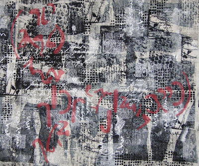
 I've been doing a fine job keeping my studio in an uproar for the past few days, between working on the second Parables piece and trying to get these small works done and mounted on painted canvas frames to sell at the Memorial Art Gallery. The first set I did was in greyscale with accents of red. Scroll down and you'll get a quick tour of them. I stitched repeating lines of light grey thread to add texture without introducing another pattern.

 I played with a little bit of hand stitching on the final one... the habotai silk really was a good choice for the ground. It has a nice glow to it.
 I completed the stitching on another four pieces in an autumn pallette and had a great time creating the language-like lines. The small pieces are definitely a nice break from larger works. And since I want to do a whole wall of multiple greyscale pieces for my exhibit in May, I will continue to work on these and decide how many I want to hang together and how I want to group them. I'm thinking of starting with five rows of five 12" x 12" framed pieces. Moving on the next four:


 These eight are ready to glue to the painted canvas stretcher bar frames that I have in my painting studio, so I'll head up there tomorrow. They can dry overnight and Tuesday morning I'll pick them all up and head over to the art gallery and deliver them to the gallery manager. Whew, lots of deadlines in January!


 The next variation I considered was creating an imagined sort of dividing cruciform with the text elements appearing in each quadrant. In this scenario I imagined using angled red lines of the sheer fabric to create a cruciform similar to the first piece. But again this didn't satisfy me and I started to suspect it was because I wasn't totally pleased with the shapes of the individual elements. However I couldn't seem to tear myself away to design and create more.
 I also decided I want to include a few black sheer overlays in this piece to create some areas of darkest value. I may revisit the red lines from the first piece and try adding some of those. Since I knew I had a photographic record of the variations I had tried, I removed all the elements and closed up shop for the day. I packed up all my materials and brought them home to contemplate at home for the next few days while I return to working on small works.

 I've edited, re-edited, added, deleted and all around fussed over this piece -- now called "Parables"-- like a teenage girl for a first date. But spending some time considering my options for the final details has paid off -- I like the results. A student and friend wrote and asked me if I revise every piece this much. Because layering is an important process in my work, I often do and that's why I posted the pictures of the evolution of "Parables." I would love for you to believe that I can magically compose the elements and layers for the best visual impact the first time I try. In reality, each new piece evolves as I work on it. So do I --the lure and "sweet pain" of the creative process! There isn't just one visual solution to resolve a composition, there are numerous options. As the artist I work until the composition comes together to the best of my ability.

 The marks made by adding hand stitching are visible when close to the piece and add an interesting detail. Needle Necessities makes a variegated six-strand cotton floss that I use a lot for hand stitching.
  I used a black 28 wt.

 Well that was disappointing. This is where we could all nod knowingly and chuckle, because the red rectangles just didn't work. Then I got another brilliant idea as the evening got later and later, to stitch sheers on in irregular lines, much as I had done in my textural piece for the SDA member exhibition.
 I stopped. Now there was too much red and because of that it no longer had the visual impact that just an accent of red would give. I don't have anything against the idea of adding a red pattern over the surface except that it was not my original vision and intention for this piece.
 I would like to say that this last image is resolved, but it still isn't. In a day or two my eyes and mind will be fresher and more objective. I am not sure what else may get removed, shortened, edited -- or added!