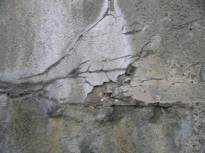
Friday, July 31, 2009

Setting the Tone for the Day

Another Note to Myself: I woke up this morning feeling out of sorts.  Every time I start taking a nose dive emotionally, the way I can regain my balance is to identify the needs that generate the feelings and take positive action to address them.

My husband is away for a few days.  I’ve been working alone all week.  I need human interaction! So I just wrote to a friend about getting together for lunch and a visit to Rochester’s Memorial Art Gallery for the Rochester Finger Lakes Exhibition. It cheers me up just to think of spending time soon discussing art and life with someone I enjoy!

I visited several favorite blogs of mine this morning. One is  Lesley Avon Miller’s  Textures Shapes and Color . When I visit blogs that are so well designed  I realize how little I know about blogger and how much  more I need to learn  about how to use blogger features. Rather than beating myself up over this, I’m going to make it a goal on my master list .

Once I turn a problem into a goal, I feel a huge sense of release.  I don’t have to deal with it TODAY, but I will focus on creating action steps to improve my blog design knowledge  over the next several months. If you can suggest any resources, please send me an email!

Taking action to address my needs is working its magic. My attitude is improving by the minute! Every thought that pops into my head this morning that  starts to erode my confidence or positivity is getting addressed in some way.  I’m staying home to do some stitching today and make a final decision about applying for a solo exhibition that I just found out about that’s due tomorrow.

I will review the materials in my data base to see if I have enough from other applications to complete the entry without it being rushed and stressful and then will spend some time stitching.

I’ll give myself a break to go out around lunchtime for an iced coffee at Starbucks and buy some fresh blueberries and raspberries at Wegmans for my yogurt. I’ll browse some art magazines for inspiration.

To gain that all important inner quiet, as soon as I finish writing and posting this blog, I will sit quietly and meditate and send out mental images of my desires manifesting!!

How's THAT for setting the tone for a day??? The longer I live, the more I realize the key to my personal well being is totally about attitude and positive action.

Thursday, July 30, 2009

Metaphoric Schucked Oysters Pile - & A Pearl or Two!

If you've ever shucked an oyster hoping for a pearl, you can appreciate how many oysters it takes to find one, IF you ever do. Hence the cultured pearl. Oyster servitude. So I tend to make my own pearls, metaphorically speaking of course.

After outpatient surgery to correct varicose veins in one leg on Tuesday, I was back at work in my studio these past two days. I have to wear a thigh high compression stocking and not do aerobics for three days, but otherwise, this is an amazingly non-invasive procedure. Thank you, medical world, for evolving.

By the end of the day yesterday I had worked long and hard -- hence the oyster shucking metaphor -- and didn't feel I had made a lot of progress.

I had mixed up a butter cream beige opaque paint with Pro-Brite textile paints and worked with ideas for layering over parts of the fuchsia paints with a very thin glaze. I kept ending up with thicker layers, no matter what I tried. My samples were caked with creamy layers of letters, screen prints, stamps, lines and blobs.

Then I had an ah-ha. Pro Brite paints take a long time to cure and permanently bond with fabric. This was barely dry and none of it was heat set, so I took it to the sink, hit it with a sprayer and started scrubbing parts of the printed on designs. It seemed that I could scrub as much or as little of the pattern away as I desired.


What remained created interesting suggestions of aging. Nice pearl! Today I applied the paint very judiciously on this piece from last week and STOPPED. I also tried turning it a quarter turn and orienting it horizontally instead of vertically. Interesting. I can add more textural paint tomorrow if I decide any area of this surface needs it. If I add too much and want to tone it down, I have a new technique to do so.

I also painted some burnt sienna over this fuchsia sample and discovered it does turn the fuchsia pink to a rust color. Yay, another teeny pearl.


Another pearl emerged as I used samples to explore ideas for the addition of letters to the surface of these two pieces. I tried cutting out fabric for fusing elements, painting with a wider brush and painting on the textural surface with a fine line applicator.

Slow work, this sampling. Tomorrow I want to try adding more yellow ochre to the paint; it's still looking a bit too white.

Monday, July 27, 2009

Notes to Myself

Since you're most likely a creative person or you wouldn't even be interested in reading this blog about art making, I decided to share some of my personal thoughts and responses as I evaluate this past week's studio work and consider how to proceed.

One lesson that seems to surface time and time again for me is to SLOW DOWN and reflect on pieces quietly, to allow more time for each choice, even if that means making only a single mark after a whole day of contemplating.

Every time I get swept up in the energy of creating the universe reminds me in some way -- fuchsia pink dyeing results for example -- that I am rushing, tearing into a meal instead of savoring each bite.

Slowing down may mean taking more time to sample and test my color palette when I use dyes so that I know how the individual dyes act, from the palest pale to darkest dark applications. And what happens to them in combination with other dyes in my palette BEFORE I apply them.

It may mean doing more sketches and studies and keeping more notes of the results for each work. Perhaps each piece I make could have its own documented history and record of its evolution. That could be a valuable resource in itself.

When I look at Da Vinci's sketchbooks and see the careful notes he wrote to himself over his lifetime as he explored a vast range of subjects, I realize how patiently he observed, recorded and considered each line, each shape, each idea.

When I'm creating, I feel as though I begin to spin faster and faster. Part of me is so keenly aware of time passing, of deadlines and commitments and even my own mortality. I begin to try and cram more and more into each day, racing against the clock or the limitations of my physical energy to produce, to make, to do.

Since creative energy also accelerates and energizes the maker, when we move into an exhilarated creative state it can be difficult to let it go, to disengage, to reflect.

I KNOW the power of stillness, of centering, of getting quiet inside. Most of us do. I experience it. But I don't always choose it when I'm working creatively.

Once I begin soaring and swooping and diving into my work and process, I find it hard to let it go, to step back and quietly contemplate what I am actually intending.

So this week I am going to practice slowness. And intention. Considering. Savoring each thought and idea like it's a delicate sliver of dark chocolate.

Quietly, confidently and assuredly living each moment of my artistic life and expression.

Sunday, July 26, 2009

Puzzling Pinkosity

Steaming turned these three new printed pieces a vivid pink-rose-fuschia color instead of the terra cotta color I got on my sample. The intensity of the color surprised me; it seems to be everywhere on the surface and looked very subtle before steaming.

Afterwards, STRIDENT. While I can identify several possible culprits for this happening to an acid dye application, it does leave me with a color that does not seem to be able to be removed or overdyed. Overpainting it with dye didn't work well. Where I added gray, it toned the powerful pink down a little but looks a bit splotchy.

I even tried shibori resists and an immersion bath in Thiox color remover, but there must be a lot of fuschia dye in this premixed color, because it appeared to discharge to yellowish tan but then returned to fuschia once I washed it. Pink it is and pink it seems to be determined to stay! The moral of the story may just be to return to mixing from pure colors rather than being lured by how pretty a premixed one looks!

So here's where I am after my first week of working on new cloth for new ancient language pieces. Mind you, I do love some areas of each of these textural pieces.


It occurs to me that were I to cut each piece apart into sections, I could choose the best sections and combine them to create a collaged surface and then add the letterforms on it with acrylic paints.

I won't get back to my dye studio until at least Wednesday-- I have to shift to completing the stitching on a piece for Fiber Art Alliance and I'm having a small surgery on the veins in one leg tomorrow. These pieces will have time to sit quietly. When I see them again my eye will be fresh and this idea will have had time to simmer. I'm hoping to walk in the door, look at them and confidently known just what to do to resolve them.

Thursday, July 23, 2009

Layer-iscious Beginnings

First order of my studio day today was a warm up with this fabric. While I didn't anticipate the terra-cotta drying pink (next time I'll mix a dark shade of it), I think I can correct and improve this by overpainting with rust and olive green. That will be an interesting experiment. If that corrects the color on the piece, then I can paint the fissures and cracks and add the letterforms and see how well the composition is working.

I left this piece to dry at the end of the day and hope that it steams and washes out and will remain as close as possible to what it looks like now. I'll steam and wash as soon as I arrive tomorrow and decide what to layer on next.

I did some discharging on this piece as well, but am still not happy with the results yet. I'll work on it again tomorrow and decide what to layer over it to begin to flesh out the composition.

This is a sample from a few months ago. Looking at it, I'd really like to complete the piece above in a similar vein (only without so much on the surface! I seem to work the samples to death just to see what happens...and one idea always leads to another... and another!)

If anything exciting happens tomorrow, I'll share the results. I'm so thrilled to be working on these ideas again and hope to create a whole lot of compositions over the next several weeks.

Tuesday, July 21, 2009

Here a Sample There a Sample...

The small studies scattered on every surface around my studio are drying and the wheels are turning in my brain as I review the strengths and weaknesses of each. Looking at what worked is a good way to review them before I return to working on new Parables pieces.

The bottom of this piece is close to what I had envisioned for it but the pearlescent color of the silvery gray at the top is too strong and I didn't use a brush that gave me the ability to keep the lines more controlled and thin. However, these fissures and crackles in the surface are going to be a priority for the next number of pieces, so I will continue to work on tools and consistencies to refine them.


This was fun and freeing and I actually like the results, particularly the black paint which I applied using a Jackson Pollock style of controlled gesturing. Because the black paint was more liquid, it wicked and created interesting shapes on the cloth before drying. The thinner lines of more viscous silver over it offer a nice contrast -- and the small shapes of red painted onto the surface offer a dynamic pop of saturated color.


This is a piece where I experimented in a few select places with adding outlines in brown around parts of the silver. The Loew Cornell liner brushes I bought recently are working wonderfully for this. Then I added a few black lines with the applicator bottle.

Sunday, July 19, 2009

Decoy Carving in Clayton, NY


Carving intrigues me, both because I love anything skillfully crafted by hand, whatever the medium -- and because carvers range from utilitarian to artistic. A number of them gathered for the 41st Annual Decoy & Wildlife Art Show in Clayton, NY this weekend. Since my husband is an outdoorsman, hunter and fisherman and I love wildlife paintings and carvings, we both had a great time.


Isn't this old carving bench a beauty? A pile of carved duck decoy bodies have piled up next to it; the carver was taking a well deserved lunch break.


Ingeniously, contemporary carvers carve over these sawdust vacuums. While wood chips and dust still accumulate, it certainly helps decrease them, which has to be healthier for a carver. As you can see from the image, this gentleman is mounting the heads onto the carved bodies.


We bought a wonderful hand painted collector's piece from Linda Ferguson in Woodville, NY. Linda does exquisite painting on these carvings.

A collector's estate auction drew us outside at 1 PM and although we both swore we would be very self-controlled, we ended up buying -- and spending!! -- more than we intended. I totally fell in love with a vintage framed Remington poster and went way over the amount I intended to bid for it. But we hung it up at our cottage and I still love it anyway -- maybe even more now that I've invested money in it!!

Another favorite stop for me when we go to Clayton is the Thousand Island Arts Center home of the Handweaving Museum, which has a collection of over 1,400 handwoven items. Currently on display there is a very nice juried exhibition, "Along the Rivers Edge," that runs through August 28. If you get to the area, stop in and see it.

Bob's sister and brother-in-law live in about a half hour outside of Clayton, so they met us Friday evening at the quaint Wellesley Hotel, built in 1903, on Wellesley Island (Thousand Island Park) for dinner.

We visited them on Saturday and got updated on the progress of the new home they're building (Jim is doing ALL the work himself!) on a solid rock ledge over the gorgeous St. Lawrence River. It will be a beauty when he finishes it.


Imagine having this view outside your window every day!

Wednesday, July 15, 2009

Reaching for the Off Switch


Experimentation continued both yesterday and today. Adding colors and layers to the work from Monday filled most of the day yesterday along with a few new beginnings, like the painted piece started above.

I went to bed tired last night but couldn't fall asleep, then woke up at 3 AM with new ideas pulling open my eyelids. If you've ever woken up in the middle of the night with ideas singing a hallelujiah chorus in your brain and the harder you try to go back to sleep, the louder they sing, you'll join me in wishing you could have a switch hardwired into your brain that you could flick on and off.

This piece has improved since Monday. The addition of the darker grays in the lower portion, the strong contrasts between values and hard and soft edges and the silk screened rows of vertical letters add a lot of interest and vitality. I'll try stitching on this surface next and see if that completes it successfully.


Today I worked first on bolder lines with a variety of applicators and paints that varied in viscosity. Some of the "aliveness" I'm desiring is starting to emerge in this sample. Larger lines with bigger tools may be the next step with this practice.

After a few of these pieces, I decided to work from a reference. I've got a series of photographs taken of the walls of an underpass near my studio. I love them. Here's one of the original images and my progress on fleshing out the interesting patterns of cracks and discolorations on the concrete walls. I am really having fun with this one and it's the closest to representational work I've done -- surprise, I like it!


This is a piece of dyed fabric left over from another project. The golden yellow seems to be a good ground for layering grays, blacks, rusts, tans and whites over.

The bottom area in progress, still wet but very pleasing to my eye-- will see it dry when I return on Monday and then continue.

Tomorrow we will head off for a weekend in the Thousand Islands, so my overloaded brain will get a break..until I return to this piece and can enjoy fleshing out more fissures, cracks and contrasts on its surface! This is another piece that I would like to paint on a LARGE scale.

Monday, July 13, 2009

Samples and Options

I decided to start this week by working on a group of studies for new works. Here are some of the steps you can take if you'd like to do the same.

Cut fabric into approximately 20"x 20" squares until you have a number of them in a pile. Mix a palette of colors. Have a rough idea in your mind of what you plan to work on. For me today it was to create some gestural handwriting compositions using various viscosities of paint and several different brushes and screen prints. Take a deep breath, grab a fabric and tape or pin it down and just start working.

Once you've made a number of samples that respond to one another and to your original idea or intention, take some time to pause and reflect. This first piece was a true warm up, I just grabbed a brush and began to put marks on the surface, then responded to them with varying brush strokes and colors.


Once I completed four or five samples, I dried them with a hair dryer and put them up on my design wall, then photographed them and loaded them on my computer. Looking at them as images on a computer screen really gives me a different perspective on them. Details that didn't seem prominant when I looked at them on the design wall become very apparent when I look at the image; the reverse is true also. Areas I think will be very dominant may not always come forward in the photograph.

This piece was painted with diluted paint on dampened cotton. When the fabric was still wet, I added the black letters using thicker paint and a thin tipped applicator bottle. The letters hold their basic shapes but some of the paint migrates and creates interesting halos. Some areas of this piece work better than others. I like the migration of the thicker paint applied to the wet surface. The partially erased line of letterforms at the bottom is another idea that works for me.

Here's a detail so you can see the halos better.


This piece began with repeated screen prints of a design I had made into a silk screen on Saturday from vertical rows of invented cursive writing. Today I printed one of these screens on the cloth, let it dry and then added the gestural handwriting. The vertical stripes of language seem to help anchor these letterforms. Then I experimented with the thin red lines over the gray calligraphic marks on this and several other similar pieces.

On another sample, in contrast to the more defined shapes in the first composition, I decided to create a more subtly painted surface and leave some less defined areas to develop with stitching -- either machine or hand.


Once I hung this, I wondered how a third and final layer of calligraphic writing might work on this piece. The bamboo brush with its bristly, frayed ends might make marks that are an interesting contrast to these.


Here's a sample of what such a mark would look like. A FEW thick, feathery strokes are what I'll try adding to the piece above this one. It may not work at all, but since these are all samples, the whole point is to execute each idea to SEE it.

Friday, July 10, 2009

Settling In

Yesterday was day three back in my studio. I did a lot of experimentation and thinking that boiled down to leaving with a longer list of to-dos than I had when I arrived. First I decided to apply gold leaf over the rest of the rectangular gessoed frame that I didn't use when I cropped and put "Lists", the new piece -- see the previous post -- on a square frame instead.

If it's oriented vertically, it has the feel of an ancient bronze artifact.
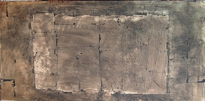
When it's oriented horizontally, it almost looks like an open book! Either way, it offers a lot of possibilities.

This piece is one of those happy accidents. The original gold metallic leaf I applied was from Dick Blick. When it ran out I bought a different brand from Michaels -- and the different brands have a slight variation in the gold color.

My plan for this one -- if the Muse smiles on me -- is to do another layer of glaze, this time copper rather than black, then layer on some gessoed, painted papers and some tinted rice papers. I hope to exaggerate the "cracks" that some of the black ground that shows through the metallic leaf suggest and then complete it with hand painted Etruscan-style letter forms. So it's a variation of my Australian piece but using totally different materials.

Speaking of that Australian piece -- check here to refresh your memory of what that piece looks like -- part of my day was spent reviewing my image files of the development of that work. Seeing the images brought back the details of the techniques I used to develop that -- all the more reason to document the development of your work, folks.

Today a new length of silk goes on the print table and work on the first layer will begin, building on the style and imagery of that piece.

In planning for new pieces in this same vein, I'm seriously considering making silkscreens for 26 large and 26 small drawn and painted Etruscan letters with thermofax stencils. That would take time and a LOT of materials, but also would give me a way to easily lay down letters with dye, resist or discharge paste without direct painting every letter. One offers spontaneity and is more gestural and the other method offers predictability and more control. I'm guessing a combination of techniques will be most interesting, since I work with a variety of improvisational screen printing methods as well. I'll make several screens today and try them out before I get myself up to my eyeballs in designing and taping screens so I can evaluate just how useful they will be.

Wednesday, July 8, 2009

New Piece!

Lists, 20" x 20", 2009, by Jeanne Raffer Beck. Monoprinted, screen printed and painted silk with copper foiling and applied synthetic sheer mounted on stretcher bar wrapped canvas, $900.

Arrive early and stay late --now there's a recipe for a productive studio day! Yesterday flew by, from warm up exercises with gestural writing and testing different brushes and paint consistencies to taking a work that I wasn't quite sure how to complete and suddenly knowing exactly what to do with it -- and being willing to lose the piece if the idea didn't work out. Happily it did!

The day brought an unexpected e-mail from Ken Smith in Australia, one of my all time favorite teachers, who is also a gifted artist. He sent a link about artist GW Bot in a blog post by Sue Lawty (another extraordinary Australian artist) called "Glyphs and Lower Molongo Valley",
http://www.vam.ac.uk/vastatic/microsites/1395_lawty/wordpress/?p=113
whose work with language imagery is inspired by natural forms in the Australian landscape. Another inspiration and resource as I delve deeper into this body of work.

Monday, July 6, 2009

Reaching Cruising "Attitude"


After being away from my work for so long, I decided to return to my studio today without any goals or agendas and just be open to any activity at all to get my motor running again. It seemed wise to let creative momentum begin to build gradually without putting any pressure on myself. Once there for a few minutes, I seemed to be more drawn to completing some pieces already in progress than embarking on new work.

This piece is one that I set aside a few months back. At that time I was unsure how to -- and whether to -- complete it. Today I felt strongly that I wanted to add a layer of gray-blue to the surface and strengthen the value and color contrasts on the piece. The Dy-Na-Flo paints work well for layering; they have the same concentration of pigment as thicker paints, but are thin and more liquid.


I'm still debating whether it's really working. One option might be to cut it down in size like I have in the image above so the major element is more dominant. I like the addition of the blue, but it's already such an active piece that I may have taken it too far. It reminds me of watery reflections.

I always am happy when I am painting, whether on cloth or canvas. I love the movement of painting, how I can vary the movements of the brush and change the marks.

As I worked and puttered with several different pieces, I suddenly realized how relaxed and unpressured I felt about whether any of them eventually work out or not. This active but totally relaxed attitude felt smooth and easy. May I stay in this pleasant "cruising attitude"!

Thursday, July 2, 2009

From Big New Car to Small New Brushes

First and foremost, a great relief -- after two and a half days of many dealers, test drives, models and prices, I chose a Toyota Highlander. It will take us on our future travel adventures in total comfort. Unlike my previous 2000 Nissan Maxima, which I pledged to drive for 10 years or 200,000 miles, I made no such pledge this time! This is a big vehicle for me and after a few years if I want to go small and sporty, I'm making that clear right up front to the big-is-better vehicle lover in our house.

Meanwhile, even though I'm leaving again tomorrow for the holiday weekend, I just had to spend some time at my studio today, even if only for the afternoon, to test out these amazing new brushes. I purchased them at the Surface Design Association conference. The vendor, Ying Zhou, is a potter from Philadelphia-- she makes each brush by hand. Before purchasing, I was able to try out the brushes with water on a special plate that shows the marks each makes. Each brush has its own character and a slightly different feel to it, even though some may be similar sizes.

This bamboo brush intrigues me. The end of the piece of bamboo has been split so the actual fibers of the bamboo form a brush -- much like chewing the ends of a stick to create a crude brush and with a light hand, the marks of the individual fiber are apparent on the paper.

This is the largest and most expensive brush that I purchased; it has a full head that makes broad strokes but has that wonderful long tip for ending or beginning lines with a narrow flourish.

The overwhelming need to explore making marks with these new brushes came into focus particularly so today because I happened onto a marvelous blog this morning called "tackad," written by artist Dean Aldrich in Horseheads, NY. Dean's post on "Carved Calligraphy" includes a You Tube video of Elliott Puckett's new exhibition at Paul Kasmin gallery in NYC. Of course I love the flowing lines and movement the artist creates, as well as how she literally carves the lines into the gessoed board. Wonderful work.

Dean's blog is a veritable gold mine of text, mark and abstract calligraphy references -- and I am eager to revisit it after the 4th of July weekend with family, where once again I will have no internet or cell phone service. Our little cottage is a great place to go unplug; but I've already had enough unplugging for a while, so will be happy to see the light of my computer screen once again on Sunday.