Saturday, August 29, 2009

Fletcher Benton's "The Alphabet" at Albright Knox

I'm becoming increasingly appreciative of exhibits that reveal the evolution of a body of work and document the artist's process. This is the case with the display of Fletcher Benton's sculptural pieces, "The Alphabet," an engaging exhibition currently at the Albright Knox Art Gallery in Buffalo, NY. The artist, born in 1931 in Jackson, Ohio, has spent most of his adult life living and working in California. He is best known for his kinetic sculptures.

With no particular expectations that I'd particularly thrill to either exhibit, I drove to Buffalo on Thursday to meet an old friend at the Gallery's on-site restaurant "muse", where we enjoyed lunch and conversation on the patio. Then we visited Benton's "The Alphabet" and"Wall Rockets" that features a large selection of works, some by Ed Ruscha himself, but mostly by a next generation of artists who have been influenced by his ideas and body of work.

Interestingly, I felt more connected with the display of Benton's work than with "Wall Rockets." The intimate size of the space made a wonderful container for the small sculptures. Evidently Benton became quite fascinated with the Roman alphabet as a young boy and taught himself to paint the letters. He became so skilled at painting letters that he was earning money as a sign painter by the age of 13.

The lit cases hold shelves of small painted steel structures created from the twenty-six letters in the Roman alphabet as well numerals 0-9.

These displays of tiny white maquettes captured my imagination immediately, first because the pencil lines of the artist's sketching were apparent and I could see the slight corrections he made before cutting them and second, because they reveal a sense of creative play that seems to characterize much of Benton's sculptural works.

Benton began working on these sculptural forms based on the Roman alphabet in the 1970's and completed the last of them just a few years ago. Some of them have been translated into large scale sculptural installations. While there are images of large-scale, installed sculptures on the walls, viewing the smaller scale ones together in close relationship to one another engaged my imagination more.

If you do go to the link above and visit Fletcher Benton's website, there are links to part 1 and part 2 of a video that provide a brief overview of Benton's career and artistic evolution. It's well worth viewing. Benton's growth and development as an artiist can offer inspiration and insight for developing artists. I felt an immediate kinship and appreciation.

Wednesday, August 26, 2009

The Accidental Archeologist

Who knew clearing and sorting could be so -- introspective?!?!? This silk painted scarf is from a water soluble resist class with Christine Zoller at QSDS in 2001 -- can you believe that I, who can't remember most places, dates and names, remember exactly when, where and with whom I
made this sample?!?! And that I've saved it -- and all my other such class samples -- for nearly 14 years??

Going through the boxes and piles of samples, I could actually organize and map out the trail of my development as a surface designer and artist through the entire array of surface design techniques. And make all of you who are just beginning down this trail feel oh so good at how oh so unpolished and rough most of them are!! How does one get color, pattern or texture on a piece of cloth? I've studied and practiced such a variety of ways that it dizzies me to even go through these that I have done so much work in so many directions.

I have a friend who took a silk painting class 14 years ago and she's been silk painting ever since. Silk painting is all does and she does it beautifully. A singular focus. Wow, how did I miss that gene??

In contrast, I went on an extended, around the world cruise of surface design techniques. Why? I have always envisioned each technique as richer when combined with another one. The desire to mix mediums seems to be in my DNA; and you can't mix them if you don't know how to do them. So I studied the techniques that I was most drawn to; not just took classes, but came back and worked with the techniques through hundreds of yards of cottons and silks.

The common threads that seem to run through all these various stages in my explorations and fascinations? It boils down primarily to three.

The first is texture, probably a given for a person who chooses to work with textiles -- and trust me, I've tried just about every conceivable tool and technique to layer and build textural surfaces with dye, paint, free motion embroidery and hand stitching. What a versatile medium, who could NOT fall under its spell??

The second focus is mark. Initially, like so many other textile people, I seemed to breathe and exhale repeating patterns, but then I realized I was actually just making -- well, fabric. As in cut it up and use it for garments or wall hangings yardage. My desire was to create compositions on my cloth -- paintings with the addition of stitching to define and add those textural elements that I seem to crave.

The third area of focus is meaning. Making art is about making meaning, as my friend and author Terry Barrett writes. I tend to think it as a plot or story because of my writing background. What story do I wish to tell with my work, what are the thoughts and ideas behind the compositional choices that I make? When children read, there are beautiful illustrations that make the story quite clear. Words are almost secondary because the images reveal the story.

However, only the suggestions of the story need to be present in visual art. I don't want to make them so obvious you say -- oh yeah, there is Goldilocks and there are the three bears. I want the story to be suggested or implied rather than explicit. Ideally, the composition reveals suggestions and clues for the story within the work. Am I intentionally "hiding" the meaning in the surfaces? No, but sometimes the meanings are private and I want to only reveal a little and let the viewer create their own story from looking at it.

I realize there's been a progression in my self-designed "graduate studies" in fiber art and that I've entered a new phase. Now the real work has begun, digging deeper into the conceptual side of the work, refining the ways I tell each "story", distilling the ideas and techniques into a clear and powerful personal perspective. THAT is a challenge every artist faces.

Since I believe that creativity is inherent and that every individual is a unique expression of creative energy, my "job" is to allow that expression from deep within myself to grow and expand and refine through practice and experience. The more I allow and trust, the more that powerful personal voice can grow.

It's a life's work and passionate engagement. Which does remind me that I had best finish the mundane sorting and cleaning these closets so I can get back to it!

Monday, August 24, 2009

Time Capsule?


Perhaps it's that natural pendulum swing that happens after an intense week of studio work, or the cool air when I woke this morning that felt suddenly more like autumn than summer. Whatever the stimulus, the day led me in an unexpected direction. I seemed to be overcome with a sudden need to find out what actually is stored in my textile storage closets, weed out what I'll never use and organize the rest so I can actually find something when I am looking for it. While the squirrels outside may be starting to build storehouses of nuts and seeds, I seem to be doing the opposite, unearthing the many ghosts of past classes and fascinations.

Of course the first step in doing this is to make a mess, ripping fabrics off shelves and out of storage boxes. It is almost like opening a time capsule of many techniques that I've experimented with -- and abandoned! -- over the years.

I'd love to say I've unearthed forgotten treasures, but most of the scraps and small pieces, other than my printed silk samples, are pretty expendable. I may fill up a huge garbage bag with all these and take them to my fiber group and give them all away. They may be just the treasures that someone else will give a much more appreciative home!

Here's the moment of satisfaction that makes doing this worthwhile, opening the door to this closet in my sewing room and not having a single roll of silk or cotton fall out or get stuck in the track when I try to close the door again. Right next to them are all my fusibles and my last remaining roll of batting.

Perhaps it really is the end of summer that's in the air. Obviously something has me under its spell -- I hope the same motivation bubbles up again when I return to complete the storage area in the other bedroom!

Wednesday, August 19, 2009

A Better Day Dawns

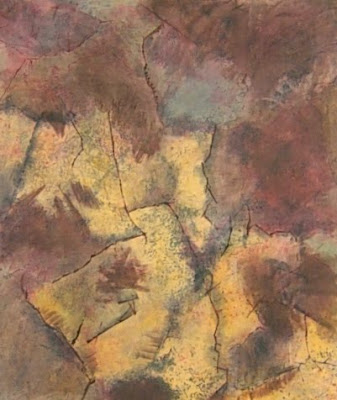
First the results...THEN the story! Here are the befores and afters of overdyeing the failed fabrics. This time a lot more of the golden yellow struck and stayed, although I lost some of the deep gold tones. The rose tones underneath the overdyeing are still very obvious, but at least now the other colors on the surface are coming through.

FIRST PIECE OVER-PAINTED,DRIED AND READY TO STEAM:


AFTER STEAMING: Some of the warm tones fade back to gray and rose.


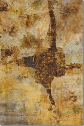
SECOND PIECE OVER-PAINTED, DRIED, AND READY TO STEAM:

AFTER STEAMING: Again some of the saturation has softened, but I am quite happy with the results on this piece and can begin designing the areas that will have letter shapes added.


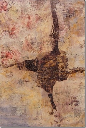
THIRD PIECE: REPAINTED, DRIED AND READY TO STEAM


AFTER PROCESSING: ANOTHER POSSIBLE ORIENTATION


So, last time you visited here I was weeping over the sorry state of my acid dye results on silk and struggling to understand WHAT IS HAPPENING. I consulted with Nancy, a technical consultant at Pro-Chem (she was hugely helpful and best of all, truly concerned about helping me solve the problem). We considered every possible scenario and finally decided I should just add more dye activator (ammonium sulfate) to every dye I had mixed.

I have a storage container and a dedicated 1/2 tsp. measuring spoon for the ammonium sulfate. I measure out three 1/2 teaspoons to get the 1.5 tsp. per mixed half cup of dye or print paste. I have the measurements marked on the side of the container so I know exactly how much to add every time. Experience has taught me not to trust it to my memory.

But this time when I pulled out the measuring spoon, I paused. It looked -- small. Putting on my reading glasses, I suddenly realized that my dollar store measuring spoon wasn't the half teaspoon one at all, it was the quarter teaspoon. Mea culpa, mea culpa, the mystery is solved and the perp is ME!! All the dye fussing, cussing and sorrows could have been avoided if I had just put the correct size measuring spoon in the storage container!

There IS a lesson in this, which is why I'm sharing this totally embarrassing incident with all of you. Even the most experienced person can make a foolish -- and critical -- error. Luckily I am only a danger to my fabrics and not to myself or others!

Meanwhile, ever the optimist, I put the PROPER ratio of ammonium sulfate in my mixed dyes and painted all three pieces again yesterday. This time there was a bit of color loss after processing, but taking into account that this fabric has been through a number of processes now (it was all fabric that had been discharged to begin with), I think the results testify that perserverence is a desirable quality when it comes to surface design.

This does mean, sadly, that I have to do the sampling again with the CORRECT amounts of ammonium sulfate so I get accurate colors. But not for a bit!!

Sunday, August 16, 2009

Mixed Results

DSCN4437

These are the wash fast acid dye samples above before steaming and washing.

DSCN4453

These are the same samples after steaming and processing – but drat it, not in the same order, sorry. Note how the original rust and paprika colors turn almost a bright rose once processed and lighten down to shades of pink.  I won’t use these in my palette. These also clumped together in the washer and I got a lot of back staining, so pink seems to have invaded almost every strip.

The grays and browns seemed to fare a lot better in the sampling and I’m optimistic about using the charcoal and smoke gray, less so with the mouse gray, which has the lavender cast to it.  The brown works well too. The processed green has far more blue in it while the unprocessed color has far more yellow.

As I suspected, the new cloth I painted and printed also changed color in a few places as well once I steamed and washed it.

DSCN4449

Dried dye, before steaming.

DSCN4456

After steaming. The results are quite surprising and I’m going to check with Pro Chem tomorrow yet again to see if I’m overlooking some extremely important detail!

Where did all that wonderful warm, yellow gold go?? The areas where it remains are the ones where the application was the most concentrated. I actually discharged the top left and right quadrants  on Friday after processing the piece where I had impulsively printed those dark brown marks. You can see that those are now a sort of rust color which quiets them down a little.

Needless to say, I was disappointed in these initial results. Part of me knows it’s just a first layer and I can work with additional layers of dye and paint to flesh out and complete that brown shape, but another part of me wants to set this aside and start over with a new piece of cloth and use this one to test out ideas.

I’ll decide once I get to my studio next which it will be!

Thursday, August 13, 2009

Rest in Peace, Rowenta Iron

Oops, make that RowentaS - plural - not just one but BOTH my Rowenta irons died over the past 48 hours, the one at home AND the one at my studio. It's actually pretty sad, they just stopped heating and then the water started to leak out at the bottom of each iron and pooled around them. Unexpected ka-ching. Replacing two at once will not be cheap and I don't like the less expensive brands I've tried. Consumer loyalty -- I hope the Rowenta people appreciate it!


My linear side made me do these samples of the dyes I want to use for the next group of pieces, so I can see how they react at every level of gradation. I got tired of this quite quickly because it involved a lot of measuring and then a lot of cleanup. However,the unexpected pinkosity steaming results from last time kept me on task! These are not steamed yet, but I will know soon exactly what happens as a particular dye color is diluted to a lighter and lighter shade. I'm going to do one more large sample by painting horizontal lines of each dye color crossed by vertical lines of the dye colors. That way I can see what results I can get, if any, as the dyes interact with each other.


The only way I could stick with doing the samples was to play a bit. I had several ideas for monoprinting a new length of cloth and tried out these ideas on paper.


Another break to try ripping and placing paper resists on the piece of cloth laying on my print table for when that sampling is complete. Are you beginning to notice that my attention is wandering?!?!


Attention, smention. My self-discipline breaks down and despite not having steamed the samples, I start to work on this fabric. I'll just do a little bit, I say to myself, and then get back to my samples, honest.....(the five year old comes out in me easily.)

Well, of course you know what comes next! I decide what the hey, this is experimentation at its finest and keep working.

This is a first layer, still wet here, but the shape and letters may develop into something that works.

But of course, there is still the steamer ahead and what surprises that may bring. I have altered some chemistry on this piece as well so now I'm using auxiliary in the print paste so when I mix up lighter values I keep the same ratio of auxiliary to dye.

So I did get the first set of samples done AND I got to try out several new ideas on this piece of cloth. BOTH sides of my brain ended the day happy!

Tuesday, August 11, 2009

Finishing Up the Newest Seeds of Compassion Piece


I've completed all the stitching and added the pinpoints of color on this third Seeds piece. Right now they're basted down, will get fused and stitched down permanently when I'm absolutely sure this placement is final -- and I'm starting on the facings. After I stitched this piece I fell so in love with the organic edges that I couldn't bear to square them off or straighten them, so I cut them a bit more deliberately and feel good about this choice. It really seems to help it seem to move and almost vibrate!

I would love to not put any facings at all on the edges, just leave them raw, but I used a cream batting and that shows at the edges, which means that I'll save this idea for another piece. I thought about inking or painting those edges to hide the white, which I've done before, but decided that I'll finish the edges this time and save the experimentation for when I have more time before a deadline.

Tomorrow all three pieces will go to my studio to consider whether to add a few subtle screened letters to this piece like the other two have and whether any of the three need a single other detail changed before I take them to be professionally photographed. Viewing the three together really is educational for me. While I'll be setting this series aside for a while, I have numerous new ideas for it that I suspect will draw me back. However, new letterform pieces are up next.

Saturday, August 8, 2009

Being Kind to Me Day


The textural stitching in the black areas that surrounds these rows of seed shapes is progressing. This is the third piece in my Seeds of Compassion series. The long dense lines of stitching create an appealing texture, so while it is slow to execute, I love watching the transformation of the whole surface.

Because the stitching is very repetitive and physically demanding, when I woke this morning, instead of running directly to the computer and coffee pot, I stretched with the excellent Gaiam DVD a.m. & p.m. Stretch with Madeleine Lewis. One of my pledges to myself is to spend more time stretching and lengthening the muscles that exercise and my active days contract. It felt soooooo good. I of course felt supremely virtuous to actually get up and DO IT.

I stitch for a while and take frequent stretching and walking breaks. On one break I carried out contributions to our compost bin and then picked fresh lettuce, green peppers, roma tomatoes and yellow squash from Bob's gorgeous garden. I feel like I'm living a chapter from Barbara Kingsolver's Animal, Vegetable, Miracle as I experiment with new recipes for our bounty! Tonight's dinner will be fresh corn from the garden and veggie burgers made with tons of veggies including our basil, carrots and yellow squash. The recipe is from a July 22 Boston Herald article titled: "Where's the beef? We search for Hub's best veggie burgers." This one, called The Druid's Veggie Burger, got rave reviews. I'll let you know if I agree!

Today's postal delivery brought a wonderful reference book, writing on the wall: word and image in modern art by Simon Morley for the lecture I'm starting to develop about my explorations into language as visual imagery. I also found time to start gleaning images from my files to accompany my presentation.

Glancing through the book makes me proud of all the research I've done over the past few years; how many of the artists and works I recognize! I honestly didn't know more than one or two of these artists when I first developed my own interest in this subject three years ago.

So I'm stitching, playing uplifting CDs, being good to my body with stretching and healthy fresh foods and feeling as though I am creating an absolutely wonderful day for myself. Hope you are finding some ways to be good to yourself today too!

Thursday, August 6, 2009

Twin Engines

Full moons always bring a burst of energy and productivity, so this week I've been dividing my time between stitching at home and painting at my city studio.

I'm anchoring each individual seed shape on this 44" x 54" silk habotai print so I can fully stitch it and then add the colored "seeds" inside the "pods". There are 37 vertical rows and I've completed 20 -- after today I'll focus on completing this piece.

On painting/printing days I've been working yet again on tools and techniques to expand and refine my options for language marks.

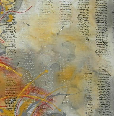
Scraps of painted fabrics get sacrificed to experimentation. Sometimes I layer one experiment right over another, just to see how the marks and lines interact, but you know by now that I'm fascinated by the layering process and the interactions between the layers. The small, gold-tipped applicator bottles on the right of this picture-- available from Pro Chem-- create wonderful writing lines, but somewhat similar, so I spent part of the day yesterday exploring techniques to expand my options.

See the red lines on this sample? They're straight from the applicator bottle. Now look at the grey and yellow gold lines -- they're way more interesting to me. I'm combining applicator painting with monoprinting in several different ways to accomplish this and I think the results have promise, so it was worth sacrificing this less than successful composition for the sake of "scientific" investigation!

I never liked the red lines on this piece which is why I sacrificed it for sampling, but I may be able to salvage a portion of it for a !2" x 12" stitched, framed piece. I'll try a more deliberate composition with these new techniques today.

Saturday, August 1, 2009

Second Piece for Fiber Arts Alliance


Letter Rhythms: Topography, 18" x18" unframed. Painted textile, stitched and mounted on canvas frame, 2009.

This second piece in the Letter Rhythms series alters the horizontal orientation of the cursive script in the first work. Abstractions of topographical and latitude/longitude lines suggest the exploration of a new territory where writing becomes visual imagery and the gestural marks hint at the rhythms of the human voice.

Today was the deadline for completing and submitting my second piece for the Fiber Art Alliance group exhibit called "Natural Lines." My piece, Letter Rhythms: Topography, above, arose from the desire to see how I might simplify the previous composition. This is not a professional image so the color isn't quite as true, despite my attempts at adjusting it.

I added running stitches with black embroidery threads over the painted letters to borrow another reference to map imagery. I like the ambiguity of considering letterforms as mapping lines but am not sure whether the stitching enhances the letters or makes them look less fluid. There will still be time for me to make small edits to this surface before I permanently adhere it to the canvas frame.


Here's my first piece, called "Letter Rhythms", so you can get an idea of where the idea for the second piece started.

I do have an idea already for the third and final piece for Fiber Art Alliance's "Natural Lines" exhibition, which will be even more minimalist and involve exploring a single gestural letterform.

While I normally find working to themes or challenges truly difficult, line is intrinsic to gestural handwriting, so I'm finding that the process of creating these small works is contributing worthwhile ideas and perspectives to my other work.