Monday, December 31, 2007

Eight Small Works Ready for Frames

I've been doing a fine job keeping my studio in an uproar for the past few days, between working on the second Parables piece and trying to get these small works done and mounted on painted canvas frames to sell at the Memorial Art Gallery. The first set I did was in greyscale with accents of red. Scroll down and you'll get a quick tour of them. I stitched repeating lines of light grey thread to add texture without introducing another pattern.

I played with a little bit of hand stitching on the final one... the habotai silk really was a good choice for the ground. It has a nice glow to it.

I completed the stitching on another four pieces in an autumn pallette and had a great time creating the language-like lines. The small pieces are definitely a nice break from larger works. And since I want to do a whole wall of multiple greyscale pieces for my exhibit in May, I will continue to work on these and decide how many I want to hang together and how I want to group them. I'm thinking of starting with five rows of five 12" x 12" framed pieces. Moving on the next four:


These eight are ready to glue to the painted canvas stretcher bar frames that I have in my painting studio, so I'll head up there tomorrow. They can dry overnight and Tuesday morning I'll pick them all up and head over to the art gallery and deliver them to the gallery manager. Whew, lots of deadlines in January!

Saturday, December 29, 2007

Second Parables Piece: Trying Out Ideas

I dove into my second Parables piece yesterday after a wonderful Christmas with my family and a quiet day or two to read Doris Lessing's Mara and Dann: An Adventure -- I've been reading books about art and artists and language almost exclusively and it was delicious to create an island on the couch and spend a few days and evenings devouring a novel, even though a somewhat bleak one. So I returned to my city studio yesterday and pinned up this piece in progress on my design wall with the optimistic notion that I had ah-ha-ed my way to the perfect resolution for adding a red layer to the work. The ah-ha was a combination of happening onto the piece of paper below in my studio with an intriguing selection of partially deconstructed letter forms (rejected for a previous project) and a consultation with a fellow artist on options for this second piece. (By the way, I confess that after having the first piece photographed professionally, I brought it home and revised it again! So I will need to have it rephotographed and will eventually post the two completed pieces together when they reach the finish line.)
But back to the current piece. I first imagined the two large lines of these deconstructed text forms stretching across the work bracketed by two curving lines that could be interpreted as parentheses.

So I fused some Steam a Seam 2 Lite onto red dyed sheer fabric, enlarged these letters and cut some out for experimenting.

I spent the rest of the day trying out some variations using the text elements. I started out with the idea of running the text somewhat horizontally across the surface. The bottom right area appealed to my eye, but not the top left. The next variation I considered was creating an imagined sort of dividing cruciform with the text elements appearing in each quadrant. In this scenario I imagined using angled red lines of the sheer fabric to create a cruciform similar to the first piece. But again this didn't satisfy me and I started to suspect it was because I wasn't totally pleased with the shapes of the individual elements. However I couldn't seem to tear myself away to design and create more.


Another variation among the many that I considered was to use the letter forms themselves to create lines across the surface. This has possibilities, but by this point I was recognizing that I definitely needed to revisit the red letter forms and create more of a variety in scale and shapes.

I also decided I want to include a few black sheer overlays in this piece to create some areas of darkest value. I may revisit the red lines from the first piece and try adding some of those. Since I knew I had a photographic record of the variations I had tried, I removed all the elements and closed up shop for the day. I packed up all my materials and brought them home to contemplate at home for the next few days while I return to working on small works.

It is a challenge to try to determine how I can best get this piece to express my concepts while still being very attentive to compositional elements that unify the layered surface. Although it would have been great if my original idea had been a winner, I gathered a significant amount of information by being willing to experiment and not try to press this piece to resolve itself before it is ready. It is such a temptation for me to try and rush the creative process, so I'm viewing this day as an exercise in patience, patience, patience...and am looking forward to this "Parables" happy ending!

Tuesday, December 18, 2007

In the Works: Small Works

Colleen, the manager of the Memorial Art Gallery gift shop, e-mailed me a week or two ago about selling some of my work there during the upcoming quilt exhibition, Wild by Design, in January and February. I'll meet with Colleen on January 8th. I can take in some work I already have, but I'd rather seize this opportunity to dive into something new-- which is to create a series of 12" x 12" small works mounted on stretched canvas frames. I'm hoping that firing off a number of quick, improvisational works in a tight time frame can help me explore and develop my ideas about language imagery and provide inspiration for larger works in the future. So I started ripping some pale hand-dyed fabric into 14" x14" squares last weekend and got rolling. On this first sample I dug out the 2" and 4" stencils that I bought a while back and stencilled some block letters. They have potential -- seem to provide an interesting contrast to the more calligraphic language marks. I haven't decided whether to keep these looking like stencils or fill in the spaces, but I liked them so well that I purchased some larger ones this morning!I also explored a slightly different approach that would return to the calligraphic letters that I used in the Translations piece. This sample so far has just the first layer of color and pattern. I started by drawing a variety of letter forms from my imagination until I had about 12 that had the most appealing shapes. The little dark brown calligraphic shape on the larger white shape will get the edges burned like the letter forms on the piece below; then I will add some additional silkscreen and paint layers, masking off some areas to resist the additional layers of paint.

The burned calligraphic letter form originated with this small work that I recently completed, which is 13" by 36" inches; I'm envisioning doing a larger piece with many more blocks, each ground fabric a different hue but mid-range in value. Against that will be a dark value letter form framed by a light shape. If I do a larger piece like this one, I might add silk screened text behind or over a portion of the main calligraphic symbol or I may use resists like I did in the newest sample and add layers of varied types and sizes of text.

I burned the edges of these calligraphic shapes to give more of an aged, irregular edge to the forms. Since I am intrigued by ancient texts and the deterioration of objects through time, burning is an effective way to convey these ideas. I want to experiment with adding other burned details to my language pieces and will be working more with this over the next month.

Monday, December 10, 2007

Resolving the Red

I've edited, re-edited, added, deleted and all around fussed over this piece -- now called "Parables"-- like a teenage girl for a first date. But spending some time considering my options for the final details has paid off -- I like the results. A student and friend wrote and asked me if I revise every piece this much. Because layering is an important process in my work, I often do and that's why I posted the pictures of the evolution of "Parables." I would love for you to believe that I can magically compose the elements and layers for the best visual impact the first time I try. In reality, each new piece evolves as I work on it. So do I --the lure and "sweet pain" of the creative process! There isn't just one visual solution to resolve a composition, there are numerous options. As the artist I work until the composition comes together to the best of my ability.

So how did I resolve this piece to my (present, at least) satisfaction? The first thing I did was to create Thermofax screens and screen print repetitions of fragments of the printed white text in opaque red (I use Setacolor opaques).
Next I grabbed my trusty Aurifil cotton thread (12 wt.) and free motion stitched to create my final lines. It worked well against the slightly darker red silk net beneath it and added a textural element that contrasts nicely with the smooth printed silk broadcloth surface around it. The color contrast works well too.
The marks made by adding hand stitching are visible when close to the piece and add an interesting detail. Needle Necessities makes a variegated six-strand cotton floss that I use a lot for hand stitching.

I used a black 28 wt. Aurifil thread to hand stitch the fine lines for the threadwork that accents this area.

"Parables" heads off to Andrew, my talented photographer, this afternoon, and then I'll start work on the second piece and see if this remains part one a diptych.

Sunday, December 2, 2007

Romancing the Red

November in Upstate New York is grey and dark -- way too many scenes like this one outside my front door. But the greyed landscape, white snow and bare branches in the winter months do have a beauty -- even minus much longed for sunshine. In the "bloom where you are planted" tradition, I have decided to celebrate my surroundings with some monochromatic compositions.

The piece in progress below started life as a length of exhibition art cloth. I pulled it out and recently updated it with additional silkscreening to reflect my current fascination with language imagery. The idea of a color accent had been tickling at my mind while I contemplated this piece on my design wall -- possibly a royal blue, possibly gold or red -- and then I saw a small red rectangle of sheer organza laying on a stack of fabric in my studio. Oooh, red -- this will take no time at all, I thoughtly smugly, just to add an accent color. I cut the rectangle into three geometric shapes and placed them on this piece in what seemed like a decent arrangement. Well that was disappointing. This is where we could all nod knowingly and chuckle, because the red rectangles just didn't work. Then I got another brilliant idea as the evening got later and later, to stitch sheers on in irregular lines, much as I had done in my textural piece for the SDA member exhibition.


This first effort seemed thrilling by the time I went to bed, and I felt euphoric, but in the cold light of day I realized that the lines just weren't right.

At this point I was totally doubting the red accent idea, ready to return to a monochromatic piece. I took the piece in progress on Friday afternoon to my crit group. They all said KEEP THE RED, even suggested that it needed more. OK, I thought, go for it, and so I added more lines. I kept at it until I realized I was now creating a PATTERN of red lines on the surface -- a case of Red Running Rampant. No, NO!
I stopped. Now there was too much red and because of that it no longer had the visual impact that just an accent of red would give. I don't have anything against the idea of adding a red pattern over the surface except that it was not my original vision and intention for this piece.


So there is that word again. INTENTION. It is coming up a lot lately in my creative process right up there with REFERENCING (more about that another day). So I have been editing lines -- stitching down the sheers, auditioning the lines, then editing and removing sheers and/or stitching as I feel my way towards the combination that will satisfy my eye.

I would like to say that this last image is resolved, but it still isn't. In a day or two my eyes and mind will be fresher and more objective. I am not sure what else may get removed, shortened, edited -- or added!

Thursday, November 22, 2007

RAFA Exhibit Opens at ACC Gallery

Eighteen members of RAFA (Rochester Area Fiber Artists) are participating in our first group exhibition, which is on display at Rochester's Arts and Cultural Center Gallery until January 2, 2008. The exhibition kicked off with a reception on Friday evening, November 16th. Over 150 people attended the opening; the atmosphere was charged with excitement and the space showcased the diverse works beautifully. Janet Root created the gorgeous centerpiece in this conference room that adjoins the gallery space where we served wine and hors d'ouvres.

For many members, it was the first time they had seen their pieces hung in a gallery space. Pat Pauly oversaw the installation of the work and the results were beautiful.

The richly colored textiles, diverse styles and sizes blended together wonderfully and garnered an extremely positive response from the people attending.


This gives you a fairly good view of the overall gallery space and shows Marcia DeCamp on the right, Barb Seils, center, and my back. We're already making arrangements for a future exhibition at the Arts & Cultural Center.

Friday, November 16, 2007

Returning to Work: "Translations"

In mid-summer I committed to participating in a fund-raising project for Rochester's Memorial Art Gallery (MAG) called "MAGnificent Inspirations: The Art Quilt". The gallery invited area quilt artists to select a work from the MAG's permanent collection and interpret it in a small fiber piece. The small works will be displayed and offered for sale during the "Wild by Design: Innovation and Artistry in America Quilts" exhibit January 20- March 18, 2008.

"Wild by Design" will feature 25 quilts selected from the University of Nebraska International Quilt Study Center's collection. To quote the MAG website, “these quilts explore the once-radical proposition that some 19th-century American women were 'painting with fabric.' Ranging in date from about 1825 to 1999, the quilts were made by artists both known and unknown, all of whom share an essential quality: the desire to push the boundaries of their medium in their own time.” Go to http://magrochester.edu/ for more information.

After touring the gallery this summer, I selected "Calligraphies", an Isamu Noguchi sculpture that echoes my own interest in language symbols as design imagery. Here is an image:


I finally tackled my interpretation of this piece in a small work last week and finished it yesterday. What most intrigued me when I started to interpret Noguchi's sculpture were the shadows that the forms cast on the wall behind them, so I based "Translations" on these.


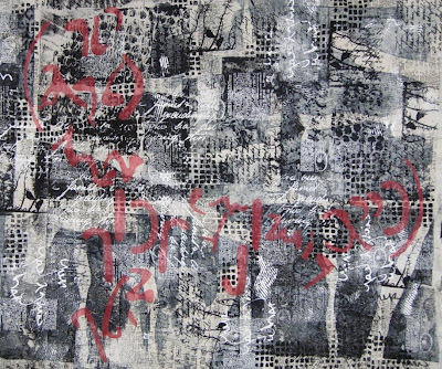
"Translations", 22" x22", 2007, $525, for sale during Wild by Design exhibition at MAG.

To create "Translations" I rusted habotai silk, then drew and selected a calligraphic shape based on the original Noguchi. I silkscreened text over cut paper resists, applied the positive calligraphic shapes from dyed silk sheers and habotai and secured them with stitching. The quilting lines echo the calligraphic shapes in the negative space.

After the deaths of my family, being able to return to creating new work has been profoundly affirming. I will be posting regularly again and sharing new pieces. Thank you to all for the caring support you have offered me during these past two months.

Tuesday, October 9, 2007

In Memoriam: Virginia R. Sheehan, Carol Ann Donovan and Michael Raffer

I lost my sister, brother and mother on August 24, 2007 in Los Lunas, New Mexico. Nothing can prepare any person or family for that much tragedy.

Virginia R. Sheehan, August 21, 1921 -- August 24, 2007

My sister called me on August 20th to tell me that our mom, after many years of struggling valiantly with Parkinson's disease, was dying. Within a day family members arrived from all over the country. My brother flew in from northern California and my husband and I from New York State. Grandchildren flew or drove there to join us. Mom couldn't talk but seemed to regain consciousness and smile each time a new loved one arrived. When everyone was together, she drifted into unconsciousness and on Friday morning passed away peacefully.


This is my mom in 2006 dressed and ready to attend the 85th birthday party held in her honor. She was always beautiful at every age.

August 24th was a sad day for our family but we knew Mom had struggled so long and so hard with her painful disease that her death was a blessing. That evening we headed off in three cars to go out to a nearby restaurant for dinner and celebrate my mom's life. My sister and brother lagged behind us a bit in leaving and they never made it to the restaurant. Their car collided with a passenger train traveling at 80 mph while they were crossing the tracks and they were both killed instantly.


Carol Ann Donovan, November 16, 1943 - August 24, 2007
Stanley Michael Raffer, January 9, 1953 - August 24, 2007


Here is one of the last pictures of the three of us together. I am on the left, my big sister is in the middle and my little brother is on the right at my mom's 85th birthday party last summer.
I miss my family. I pray their spirits are finding peace and love and comfort and that they can feel the love we will all hold in our hearts for them always. I want to picture them now with all the other family members that have left here before them, particularly my dad and grandparents. I miss them all. I love you, Mom. I love you, Carol. I love you, Mike.

Monday, August 13, 2007

Pittsburgh Adventure, Day 2: Chihuly at Phipps


This day falls into the category of, "just when you think an experience can't possibly get any better...it does!"


I would have voted to just drive straight home the second morning, since I was so excited and stimulated by visiting Fiber Arts International that all I could think about was getting back into my studio to work, but we all decided we'd just make the "briefest" stop at the Phipps Conservatory to see the gardens and glass exhibit there. Here is the entrance; already looks promising, doesn't it??? Supposedly there was a nice Chihuly glass exhibit inside -- I figured a few pieces in a few rooms and then, zip, we're on the road. SOOOOOO wrong....We wallked through room after glorious room, oohing and aahing. Each one grew from a collaboration between horticulturists and Chihuly to design unique installations that blended organic blown glass shapes and colors with natural plant materials. This is pretty much what we looked like every time we walked into a new room!
This room was filled with bright orange cannas in the background and Chihuly's brilliantly colored Cattails in the foreground.

Some spaces had water features as large as ponds, where Chihuly's blown glass forms provided contrast while complementing the natural environment.


The forms and colors of the glass varied with each space. Some of the forms were tall and frond like, some sphere shaped, and others open and fluted. I fell in love with the space below, the Victoria Room, where all the elements, including the reflections from the vaulted glass ceilings on the water, seemed more breathtakingly beautiful together than I ever could have imagined. Chihuly calls these fluted forms his Persians. They're the result of his search for new forms over the course of a year, during which his assistants crafted more than 1,000 miniature experimental forms.


You could look across this space and through a glass partition into yet another glass and plantscape in soft blues, a wonderful contrast to the warm colors in this space.


Above this beautiful display a huge chandelier style sculpture, one of Chihuly's trademarks,
seemed to float over the water and surrounding trees.


That blue glass that you could vaguely see beyond this incredible display proved to be an equally breathtaking site when we made our way into the space, called the East Room. The plant materials in this room were all silvery and cool in feeling. With Chihuly's blue floats, cobalt Reeds and turquoise Marlins, the collection is known as Cobalt Fiori or "blue flowers."


Here is a close up that shows some of the different color combinations and patterns that Chihuly creates by rolling molten glass in smaller shards of colored glass during the blowing process. The interiors and exteriors of these petal like forms are different colors. This is possible because they are separated by a layer of white opaque glass.


The bottom line is that we spent the whole morning in the Conservatory and only left because we were hungry! Barb took pictures until her memory card was completely full and I came home with over 150 shots of my own. By the time we started the drive home, we all felt our whirlwind adventure had far exceeded any of our expectations and look forward to another one in the future!

Here's the Phipps website: http://www.phipps.conservatory.org/

Pittsburgh Adventure, Day 1: Fiber Arts International

I vowed to finally make it to a Fiber Arts International exhibit this year -- after all, there won't be a chance again for another three years! - and invited my crit group to consider a field trip. The exhibition closes August 19th, so we couldn't delay. Four of us headed down to Pittsburgh bright and early last Wednesday morning in Marcia's comfortable SUV, made it in less than five hours and arrived easily at the Society for Contemporary Craft by 1:30 PM. This turned out to be my favorite of the two spaces that house the FAI exhibit. Large open ceilings, plenty of windows and natural light and freestanding portable walls added a lot of visual interest and architectural detail to this space, which felt open, airy and contemporary.

It also seemed that most of my favorite works in the exhibition ended up being in this space. We were permitted to take pictures of the overall space at SCC but not individual works -- although the second venue, Pittsburgh Center for the Arts, allowed us free rein with our cameras.

The works in the joint exhibitions represent every type of fiber art. I found the diversity of materials and mediums, that included felted pieces, weavings, mixed media, assemblages, fashion, handmade paper, quilts and books, most stimulating. I find that same diversity when I attend the Surface Design Association conference exhibitions.

Another pleasing addition to the venue at the Society for Contemporary Craft were several cases that displayed samples and sketches and notes from a number of the artists in the exhibition. This opened a window into each artist's creative process and inspirations, which always intrigues me; here is one of the cases, which also serves as display works for some of the pieces.

Below are some reference materials and notes from Cynthia Corbin.
After visiting the gift shop and purchasing copies of the catalogue. we headed over to the Pittsburgh Center for the Arts, shown below, to see the rest of the exhibit.

The first floor gallery spaces (there were four) offered ample wall space to appreciate each piece but the galleries felt more subdued.

As you can see from the picture below, the scale of the works in these exhibits ranges from huge to quite tiny. The lighting carefully highlights the works on pedestals as well as those on the walls.

We capped our day off by meeting an artist friend of Marcia's, Petra Fallaux, who took us to a wonderful little Italian restaurant on Reynolds called Pino's. She acted as our navigator so we could drive to the lookout point at the top of Mt. Washington, where we got to enjoy a view of the city and its rivers.


Here is our satisfied group at the end of long, full and stimulating day. From left to right are Marcia DeCamp, Petra Falloux, Nancy Murty, Barb Seils and me. If you'd like to see all the individual works in the show, you can purchase one of the excellent exhibition catalogues at http://www.fiberartinternational.org/ for $25.