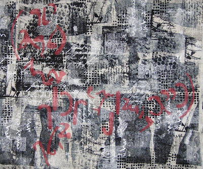
I dove into my second Parables piece yesterday after a wonderful Christmas with my family and a quiet day or two to read Doris Lessing's Mara and Dann: An Adventure -- I've been reading books about art and artists and language almost exclusively and it was delicious to create an island on the couch and spend a few days and evenings devouring a novel, even though a somewhat bleak one. So I returned to my city studio yesterday and pinned up this piece in progress on my design wall with the optimistic notion that I had ah-ha-ed my way to the perfect resolution for adding a red layer to the work. The ah-ha was a combination of happening onto the piece of paper below in my studio with an intriguing selection of partially deconstructed letter forms (rejected for a previous project) and a consultation with a fellow artist on options for this second piece. (By the way, I confess that after having the first piece photographed professionally, I brought it home and revised it again! So I will need to have it rephotographed and will eventually post the two completed pieces together when they reach the finish line.)
 The ah-ha was a combination of happening onto the piece of paper below in my studio with an intriguing selection of partially deconstructed letter forms (rejected for a previous project) and a consultation with a fellow artist on options for this second piece. (By the way, I confess that after having the first piece photographed professionally, I brought it home and revised it again! So I will need to have it rephotographed and will eventually post the two completed pieces together when they reach the finish line.)
But back to the current piece. I first imagined the two large lines of these deconstructed text forms stretching across the work bracketed by two curving lines that could be interpreted as parentheses.
 So I fused some Steam a Seam 2 Lite onto red dyed sheer fabric, enlarged these letters and cut some out for experimenting.
 I spent the rest of the day trying out some variations using the text elements. I started out with the idea of running the text somewhat horizontally across the surface. The bottom right area appealed to my eye, but not the top left.
  The next variation I considered was creating an imagined sort of dividing cruciform with the text elements appearing in each quadrant. In this scenario I imagined using angled red lines of the sheer fabric to create a cruciform similar to the first piece. But again this didn't satisfy me and I started to suspect it was because I wasn't totally pleased with the shapes of the individual elements. However I couldn't seem to tear myself away to design and create more.
 So I fused some Steam a Seam 2 Lite onto red dyed sheer fabric, enlarged these letters and cut some out for experimenting.
 I spent the rest of the day trying out some variations using the text elements. I started out with the idea of running the text somewhat horizontally across the surface. The bottom right area appealed to my eye, but not the top left.
  The next variation I considered was creating an imagined sort of dividing cruciform with the text elements appearing in each quadrant. In this scenario I imagined using angled red lines of the sheer fabric to create a cruciform similar to the first piece. But again this didn't satisfy me and I started to suspect it was because I wasn't totally pleased with the shapes of the individual elements. However I couldn't seem to tear myself away to design and create more.
Another variation among the many that I considered was to use the letter forms themselves to create lines across the surface. This has possibilities, but by this point I was recognizing that I definitely needed to revisit the red letter forms and create more of a variety in scale and shapes.
 I also decided I want to include a few black sheer overlays in this piece to create some areas of darkest value. I may revisit the red lines from the first piece and try adding some of those. Since I knew I had a photographic record of the variations I had tried, I removed all the elements and closed up shop for the day. I packed up all my materials and brought them home to contemplate at home for the next few days while I return to working on small works.
 I also decided I want to include a few black sheer overlays in this piece to create some areas of darkest value. I may revisit the red lines from the first piece and try adding some of those. Since I knew I had a photographic record of the variations I had tried, I removed all the elements and closed up shop for the day. I packed up all my materials and brought them home to contemplate at home for the next few days while I return to working on small works.
It is a challenge to try to determine how I can best get this piece to express my concepts while still being very attentive to compositional elements that unify the layered surface. Although it would have been great if my original idea had been a winner, I gathered a significant amount of information by being willing to experiment and not try to press this piece to resolve itself before it is ready. It is such a temptation for me to try and rush the creative process, so I'm viewing this day as an exercise in patience, patience, patience...and am looking forward to this "Parables" happy ending!

No comments:
Post a Comment