I dove into my second Parables piece yesterday after a wonderful Christmas with my family and a quiet day or two to read Doris Lessing's Mara and Dann: An Adventure -- I've been reading books about art and artists and language almost exclusively and it was delicious to create an island on the couch and spend a few days and evenings devouring a novel, even though a somewhat bleak one. So I returned to my city studio yesterday and pinned up this piece in progress on my design wall with the optimistic notion that I had ah-ha-ed my way to the perfect resolution for adding a red layer to the work. The ah-ha was a combination of happening onto the piece of paper below in my studio with an intriguing selection of partially deconstructed letter forms (rejected for a previous project) and a consultation with a fellow artist on options for this second piece. (By the way, I confess that after having the first piece photographed professionally, I brought it home and revised it again! So I will need to have it rephotographed and will eventually post the two completed pieces together when they reach the finish line.)
 The ah-ha was a combination of happening onto the piece of paper below in my studio with an intriguing selection of partially deconstructed letter forms (rejected for a previous project) and a consultation with a fellow artist on options for this second piece. (By the way, I confess that after having the first piece photographed professionally, I brought it home and revised it again! So I will need to have it rephotographed and will eventually post the two completed pieces together when they reach the finish line.)
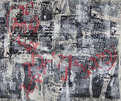
But back to the current piece. I first imagined the two large lines of these deconstructed text forms stretching across the work bracketed by two curving lines that could be interpreted as parentheses.
 So I fused some Steam a Seam 2 Lite onto red dyed sheer fabric, enlarged these letters and cut some out for experimenting.
 I spent the rest of the day trying out some variations using the text elements. I started out with the idea of running the text somewhat horizontally across the surface. The bottom right area appealed to my eye, but not the top left.
 The next variation I considered was creating an imagined sort of dividing cruciform with the text elements appearing in each quadrant. In this scenario I imagined using angled red lines of the sheer fabric to create a cruciform similar to the first piece. But again this didn't satisfy me and I started to suspect it was because I wasn't totally pleased with the shapes of the individual elements. However I couldn't seem to tear myself away to design and create more.

 So I fused some Steam a Seam 2 Lite onto red dyed sheer fabric, enlarged these letters and cut some out for experimenting.
 I spent the rest of the day trying out some variations using the text elements. I started out with the idea of running the text somewhat horizontally across the surface. The bottom right area appealed to my eye, but not the top left. The next variation I considered was creating an imagined sort of dividing cruciform with the text elements appearing in each quadrant. In this scenario I imagined using angled red lines of the sheer fabric to create a cruciform similar to the first piece. But again this didn't satisfy me and I started to suspect it was because I wasn't totally pleased with the shapes of the individual elements. However I couldn't seem to tear myself away to design and create more.

Another variation among the many that I considered was to use the letter forms themselves to create lines across the surface. This has possibilities, but by this point I was recognizing that I definitely needed to revisit the red letter forms and create more of a variety in scale and shapes.
 I also decided I want to include a few black sheer overlays in this piece to create some areas of darkest value. I may revisit the red lines from the first piece and try adding some of those. Since I knew I had a photographic record of the variations I had tried, I removed all the elements and closed up shop for the day. I packed up all my materials and brought them home to contemplate at home for the next few days while I return to working on small works.
It is a challenge to try to determine how I can best get this piece to express my concepts while still being very attentive to compositional elements that unify the layered surface. Although it would have been great if my original idea had been a winner, I gathered a significant amount of information by being willing to experiment and not try to press this piece to resolve itself before it is ready. It is such a temptation for me to try and rush the creative process, so I'm viewing this day as an exercise in patience, patience, patience...and am looking forward to this "Parables" happy ending!


 The burned calligraphic letter form originated with this small work that I recently completed, which is 13" by 36" inches; I'm envisioning doing a larger piece with many more blocks, each ground fabric a different hue but mid-range in value. Against that will be a dark value letter form framed by a light shape. If I do a larger piece like this one, I might add silk screened text behind or over a portion of the main calligraphic symbol or I may use resists like I did in the newest sample and add layers of varied types and sizes of text.
 I've edited, re-edited, added, deleted and all around fussed over this piece -- now called "Parables"-- like a teenage girl for a first date. But spending some time considering my options for the final details has paid off -- I like the results. A student and friend wrote and asked me if I revise every piece this much. Because layering is an important process in my work, I often do and that's why I posted the pictures of the evolution of "Parables." I would love for you to believe that I can magically compose the elements and layers for the best visual impact the first time I try. In reality, each new piece evolves as I work on it. So do I --the lure and "sweet pain" of the creative process! There isn't just one visual solution to resolve a composition, there are numerous options. As the artist I work until the composition comes together to the best of my ability.


 The marks made by adding hand stitching are visible when close to the piece and add an interesting detail. Needle Necessities makes a variegated six-strand cotton floss that I use a lot for hand stitching.
 I used a black 28 wt.


 Well that was disappointing. This is where we could all nod knowingly and chuckle, because the red rectangles just didn't work. Then I got another brilliant idea as the evening got later and later, to stitch sheers on in irregular lines, much as I had done in my textural piece for the SDA member exhibition.

 I stopped. Now there was too much red and because of that it no longer had the visual impact that just an accent of red would give. I don't have anything against the idea of adding a red pattern over the surface except that it was not my original vision and intention for this piece.
 I would like to say that this last image is resolved, but it still isn't. In a day or two my eyes and mind will be fresher and more objective. I am not sure what else may get removed, shortened, edited -- or added!


 I finally tackled my interpretation of this piece in a small work last week and finished it yesterday. What most intrigued me when I started to interpret Noguchi's sculpture were the shadows that the forms cast on the wall behind them, so I based "Translations" on these.
 "Translations", 22" x22", 2007, $525, for sale during Wild by Design exhibition at MAG.

 Here is one of the last pictures of the three of us together. I am on the left, my big sister is in the middle and my little brother is on the right at my mom's 85
